Artes Visuales
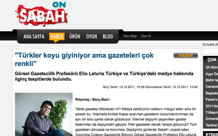
El columnista de Visualmente, el peruano Elio Leturia, es entrevistado por Baris Balci para el diario turco Sabah. Allì habla sobre la situación de los medios de comunicación de la región.

Will the tablet kill the newspaper? That is the question that keeps the media sector busy these days. As the circulation rate of the newspapers decline, the categorization of newspapers remains to be a different question mark. As the Internet evolves, newspaper design evolves along with it. So where are we heading? Where does Turkish newspapers rate amongst the world media? We discussed journalism and the future of newspaper design with Elio Leturia, Visual Journalism professor at Columbia College Chicago. While Leturia talked about the color contradiction he observed during his Turkey visit, he gave us the good news that the newspaper would never die.
What can you say about the designs and design cultures of the Turkish newspapers?
As someone with a western cultural background I have to say that the Turkish newspapers are very colorful. Every news story in the paper is trying to get your attention. As you look at one story, you find that it is not hard to be randomly scanning other news. As a westerner, it took me a while to study each detail of your newspapers.
On the other hand, design is inspired by the culture of its people. I have observed that people in Istanbul wear mostly dark colors, while the newspapers flash the news in bright, eye-catchy colors. I couldn’t understand this contradiction. I would love to study this. Why do people wear dark but their newspapers are so colorful? Your newspaper designs are loud and have multiple focal points on a single page.
Our readers prefer pictures, causing the newspapers to have more pictures and shortened articles. Editors find it sufficient to use just enough words to deliver the news presented with many pictures. Is it possible to reverse this?
This is directly proportional with the demand of the reader. When I visited Sabah, editors asked me what I thought of the design. I am in no position to critique. I do not know the target audience. If the readers demand more pictures, design in that direction will serve its purpose accordingly. Me, critiquing Sabah’s designs and offering design advice, according to my own personal taste would be foolish because I am not familiar with the preferences of the readers of Sabah. If the public is demanding shorter articles, then that is what needs to be done. A middle ground has to be found between the demands of the reader and the delivery style the newspaper wants to have. If we choose to give a 100% of everything we like, we may lose the reader.
With the new tablet technology, there is a change in journalism. How does this affect design? What are the new design trends inspired by the new tablet technology?
Newspapers give us a blank canvas to create and design. High-end programs, like InDesign, offer a chance to try different approaches. When you carry this idea to the Internet, you automatically limit your design space. Single headline, single picture and the article… A repetitive format… You are not easily able to show different materials in various formats you otherwise would on paper. You are limited by the HTML coding and CSS. But when you carry the newspaper design to the tablet, you will be able to give the reader a design approach similar to a newspaper or magazine. Also, the tablet provides interaction with the reader that the newspaper lacks. Just by touching the screen, you are able to reach different information. But who has access to this technology? I can pick up a newspaper for 60 cents, which is very affordable. An iPad costs $500 and up. The Amazon tablet might be cheaper but it is still more expensive than a newspaper. Tablet publications vary from country to country and economy to economy. For countries with large populations and small economies, newspaper provides an affordable solution. As the prices of these technologies come down and they become as popular as a cell phone, the design will take a more prominent role.

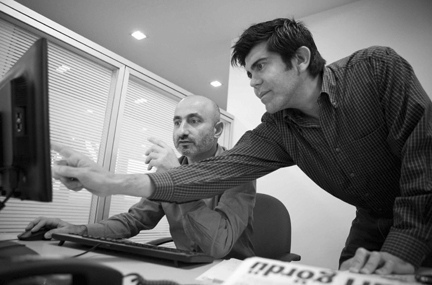
[One of the world’s leading visual journalism graphic designers, Elio Leturia has visited Sabah.]
The biggest interest to the tablets and new technologies are by young consumers. How can the interest of these young consumers be piqued when designing a newspaper?
The new generation is able to report and do their very own, personal “journalism” nowadays. They can take a picture, share it and report on it instantaneously. Democratization of the news and information sharing is what is going on at the moment. But the real question is, how much of this do we really need? Not everyone who is sharing news is a journalist. There is no fact-checking in the reports they publish. Most bloggers have little to no knowledge of design, photography, and illustration. They create blogs with a pre-designed format. Some get bored after a few months while others become a huge success like the Huffington Post. The critical thing is for us to have an understanding of who can report and write and who can’t. With time the readers will be able to say “I believe this information that I am reading because I have seen it in the newspaper, and it is provided by the professionals that I can trust. They are not the kind of people that write whatever, whenever.”
Publications online are still in need of a profitable financial model. There are two options. Either you provide the information for free and rely on advertising, or you charge for the information. You can limit the publications of the articles, photo galleries and videos on your website and charge a certain amount for it if readers want more. We are professional journalists who provide the news and need a paycheck. Many journalists have lost their jobs recently because of the economy and the free delivery of information. The newsrooms are approximately 40% smaller. For this reason we need to find a form of income for the journalist.
What are the new trends you observe in journalism?
As a professor of journalism and graphic design at Columbia College Chicago, we pay attention to this transitional period because we want our students to be able to find employment once they graduate. We encourage them to start blogs, take photographs and make videos. When I started working for the college over six years ago, even though I was in graphic design, I didn’t take many pictures. But now when I make a new entry to my blog, first I take the picture and then write the story. Some people write first and then try to find a photograph that may capture the essence of the article, but the most important element to attract an audience is the photograph. The Internet is a vast wealth of information overload. For this reason, sometimes when a news article is clicked you can move on after a few seconds because you simply don’t have enough time to stick around to read. Design is not the main concern of the online environment yet. The tablet allows us to use design and visual journalism, but if you have to zoom in to read and see the pictures of what you are looking at, you lose the chance of seeing the design as a whole. The websites need to have a high standard in visual applications. This will help to reach the non-readers. The young demographic nowadays is not even purchasing any newspapers anymore.
You also have to take the cultural differences into consideration. Each culture provides for its own needs. There are many differences between the U.S. and Turkey. For example, I was really surprised to see the proximity of people to each other in elevators; you can’t get that close to someone in the United States. The same way, newspapers respond to the demands of its culture.
Who is Elio Leturia?
Currently a professor of Visual Journalism at Columbia College Chicago, Elio Leturia has worked for the Detroit Free Press, the Tribune Company and El Comercio (Peru). Originally from Peru, Leturia worked as a graphic design professor in one of the leading universities of Peru, Universidad de Lima.
Translated by Julide Belen from:
http://www.sabah.com.tr/Teknoloji/Haber/2011/12/12/turkler-koyu-giyiniyor-ama-gazeteleri-cok-renkli
- Lo Mejor Del 2010: Viva Las Infografías Jugables, Por Ian Bogost
(Por Bender Baruch) A fines de septiembre, te presentamos este controvertido libro. Es que el norteamericano Ian Bogost (Associate Professor in the School of Literature, Communication, and Culture, en el Georgia Institute of Technology y socio fundador...
- Alucinante: Reportaje Exclusivo Al Gurú De Los Videogames, Ian Bogost
(Por Bender Baruch) A fines de septiembre, te presentamos este controvertido libro. Es que el norteamericano Ian Bogost (Associate Professor in the School of Literature, Communication, and Culture, en el Georgia Institute of Technology y socio fundador...
- Exclusivo: Hablamos Con Julian Hansen, Creador Del Typeface
(Hacer click para agrandar) (Por Bender Baruch) Te contamos que las redes sociales habían explotado con la aparición de una infografía mural que buscaba aportar soluciones al problema diario de la elección tipográfica. Te presentamos al creador...
- Working With Multimedia
(Por Elio Leturia) NOWADAYS, IN THE JOURNALISM world, multimedia is the word. People talk about audio, video, interactivity, motion graphics, slide shows. It seems that everybody has a blog and is immersed in social media. But how many people really...
- Las Infografías De Crítica En Ee.uu.
En momentos difíciles, el reconocimiento es bueno. Después del fuerte ataque de ciertos sectores de la prensa autóctona que padecimos los trabajadores del diario Crítica de la Argentina (a raíz de la renuncia del director), otros sitios extranjeros,...
Artes Visuales
Exclusivo: "Turks Dress In Dark Colors But Have Colorful Newspapers"
El columnista de Visualmente, el peruano Elio Leturia, es entrevistado por Baris Balci para el diario turco Sabah. Allì habla sobre la situación de los medios de comunicación de la región.

Will the tablet kill the newspaper? That is the question that keeps the media sector busy these days. As the circulation rate of the newspapers decline, the categorization of newspapers remains to be a different question mark. As the Internet evolves, newspaper design evolves along with it. So where are we heading? Where does Turkish newspapers rate amongst the world media? We discussed journalism and the future of newspaper design with Elio Leturia, Visual Journalism professor at Columbia College Chicago. While Leturia talked about the color contradiction he observed during his Turkey visit, he gave us the good news that the newspaper would never die.
What can you say about the designs and design cultures of the Turkish newspapers?
As someone with a western cultural background I have to say that the Turkish newspapers are very colorful. Every news story in the paper is trying to get your attention. As you look at one story, you find that it is not hard to be randomly scanning other news. As a westerner, it took me a while to study each detail of your newspapers.
On the other hand, design is inspired by the culture of its people. I have observed that people in Istanbul wear mostly dark colors, while the newspapers flash the news in bright, eye-catchy colors. I couldn’t understand this contradiction. I would love to study this. Why do people wear dark but their newspapers are so colorful? Your newspaper designs are loud and have multiple focal points on a single page.
Our readers prefer pictures, causing the newspapers to have more pictures and shortened articles. Editors find it sufficient to use just enough words to deliver the news presented with many pictures. Is it possible to reverse this?
This is directly proportional with the demand of the reader. When I visited Sabah, editors asked me what I thought of the design. I am in no position to critique. I do not know the target audience. If the readers demand more pictures, design in that direction will serve its purpose accordingly. Me, critiquing Sabah’s designs and offering design advice, according to my own personal taste would be foolish because I am not familiar with the preferences of the readers of Sabah. If the public is demanding shorter articles, then that is what needs to be done. A middle ground has to be found between the demands of the reader and the delivery style the newspaper wants to have. If we choose to give a 100% of everything we like, we may lose the reader.
With the new tablet technology, there is a change in journalism. How does this affect design? What are the new design trends inspired by the new tablet technology?
Newspapers give us a blank canvas to create and design. High-end programs, like InDesign, offer a chance to try different approaches. When you carry this idea to the Internet, you automatically limit your design space. Single headline, single picture and the article… A repetitive format… You are not easily able to show different materials in various formats you otherwise would on paper. You are limited by the HTML coding and CSS. But when you carry the newspaper design to the tablet, you will be able to give the reader a design approach similar to a newspaper or magazine. Also, the tablet provides interaction with the reader that the newspaper lacks. Just by touching the screen, you are able to reach different information. But who has access to this technology? I can pick up a newspaper for 60 cents, which is very affordable. An iPad costs $500 and up. The Amazon tablet might be cheaper but it is still more expensive than a newspaper. Tablet publications vary from country to country and economy to economy. For countries with large populations and small economies, newspaper provides an affordable solution. As the prices of these technologies come down and they become as popular as a cell phone, the design will take a more prominent role.

[One of the world’s leading visual journalism graphic designers, Elio Leturia has visited Sabah.]
The biggest interest to the tablets and new technologies are by young consumers. How can the interest of these young consumers be piqued when designing a newspaper?
The new generation is able to report and do their very own, personal “journalism” nowadays. They can take a picture, share it and report on it instantaneously. Democratization of the news and information sharing is what is going on at the moment. But the real question is, how much of this do we really need? Not everyone who is sharing news is a journalist. There is no fact-checking in the reports they publish. Most bloggers have little to no knowledge of design, photography, and illustration. They create blogs with a pre-designed format. Some get bored after a few months while others become a huge success like the Huffington Post. The critical thing is for us to have an understanding of who can report and write and who can’t. With time the readers will be able to say “I believe this information that I am reading because I have seen it in the newspaper, and it is provided by the professionals that I can trust. They are not the kind of people that write whatever, whenever.”
Publications online are still in need of a profitable financial model. There are two options. Either you provide the information for free and rely on advertising, or you charge for the information. You can limit the publications of the articles, photo galleries and videos on your website and charge a certain amount for it if readers want more. We are professional journalists who provide the news and need a paycheck. Many journalists have lost their jobs recently because of the economy and the free delivery of information. The newsrooms are approximately 40% smaller. For this reason we need to find a form of income for the journalist.
What are the new trends you observe in journalism?
As a professor of journalism and graphic design at Columbia College Chicago, we pay attention to this transitional period because we want our students to be able to find employment once they graduate. We encourage them to start blogs, take photographs and make videos. When I started working for the college over six years ago, even though I was in graphic design, I didn’t take many pictures. But now when I make a new entry to my blog, first I take the picture and then write the story. Some people write first and then try to find a photograph that may capture the essence of the article, but the most important element to attract an audience is the photograph. The Internet is a vast wealth of information overload. For this reason, sometimes when a news article is clicked you can move on after a few seconds because you simply don’t have enough time to stick around to read. Design is not the main concern of the online environment yet. The tablet allows us to use design and visual journalism, but if you have to zoom in to read and see the pictures of what you are looking at, you lose the chance of seeing the design as a whole. The websites need to have a high standard in visual applications. This will help to reach the non-readers. The young demographic nowadays is not even purchasing any newspapers anymore.
You also have to take the cultural differences into consideration. Each culture provides for its own needs. There are many differences between the U.S. and Turkey. For example, I was really surprised to see the proximity of people to each other in elevators; you can’t get that close to someone in the United States. The same way, newspapers respond to the demands of its culture.
Who is Elio Leturia?
Currently a professor of Visual Journalism at Columbia College Chicago, Elio Leturia has worked for the Detroit Free Press, the Tribune Company and El Comercio (Peru). Originally from Peru, Leturia worked as a graphic design professor in one of the leading universities of Peru, Universidad de Lima.
Translated by Julide Belen from:
http://www.sabah.com.tr/Teknoloji/Haber/2011/12/12/turkler-koyu-giyiniyor-ama-gazeteleri-cok-renkli
- Lo Mejor Del 2010: Viva Las Infografías Jugables, Por Ian Bogost
(Por Bender Baruch) A fines de septiembre, te presentamos este controvertido libro. Es que el norteamericano Ian Bogost (Associate Professor in the School of Literature, Communication, and Culture, en el Georgia Institute of Technology y socio fundador...
- Alucinante: Reportaje Exclusivo Al Gurú De Los Videogames, Ian Bogost
(Por Bender Baruch) A fines de septiembre, te presentamos este controvertido libro. Es que el norteamericano Ian Bogost (Associate Professor in the School of Literature, Communication, and Culture, en el Georgia Institute of Technology y socio fundador...
- Exclusivo: Hablamos Con Julian Hansen, Creador Del Typeface
(Hacer click para agrandar) (Por Bender Baruch) Te contamos que las redes sociales habían explotado con la aparición de una infografía mural que buscaba aportar soluciones al problema diario de la elección tipográfica. Te presentamos al creador...
- Working With Multimedia
(Por Elio Leturia) NOWADAYS, IN THE JOURNALISM world, multimedia is the word. People talk about audio, video, interactivity, motion graphics, slide shows. It seems that everybody has a blog and is immersed in social media. But how many people really...
- Las Infografías De Crítica En Ee.uu.
En momentos difíciles, el reconocimiento es bueno. Después del fuerte ataque de ciertos sectores de la prensa autóctona que padecimos los trabajadores del diario Crítica de la Argentina (a raíz de la renuncia del director), otros sitios extranjeros,...
