Artes Visuales

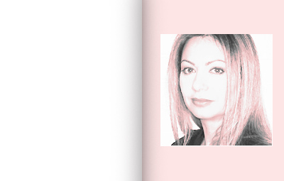
 (Lucie Lacava, consultora canadiense, Lacava Design)
Qué tipografías...: 1) Usas frecuentemente? (Por qué?)
None really. I prefer to use a new font for every project. If I ever use a font more than once, it would have to be in a completely new context. For example, if I originally used it for titling, I might use it again for navigation. But have a difficult time using the same fonts again on other projects because in my mind they are so imbibed with the essence and personality of the original project, I have to let some time go by before I use them again.
2) Prefieres? (Por qué?)
If I had to spend the rest of my life on a deserted island I would take with me Futura and Bodoni. I will never grow tired of the Didones and Geometrics, because of their clean, simple, and elegant lines.
Earlier in my career I liked using mostly the classics and their revivals. Today I have an insatiable thirst for new releases. I especially like to have new fonts custom designed for my projects, and I love these fonts because they reflect exactly my vision for the project. It's like being fitted in haute couture by Karl Lagerfeld.
3) Odias? (Por qué?)
I like to keep an open mind, because my taste keeps on evolving. But I hate fonts that become too popular, with the exceptions of a few more obiquitous, generic older fonts like Franklin or Helvetica, these are like tofu you can turn them into anything you like. I generally feel antipathy towards the Humanists, both serif and sans, especially when applied in large quantities, as in a publication. I also dislike most scripts. However, any font used in the right context and in small doses can look gorgeous. Take for instance any letter from the ugliest font ever and blow it up to 1000 points, then imagine it used as a background for wallpaper, a poster, or a t-shirt in your favorite colours, and it might start to grow on you.
- Exclusivo: Hablamos Con Julian Hansen, Creador Del Typeface
(Hacer click para agrandar) (Por Bender Baruch) Te contamos que las redes sociales habían explotado con la aparición de una infografía mural que buscaba aportar soluciones al problema diario de la elección tipográfica. Te presentamos al creador...
- Lo Mejor 2009: La Tipografía De Johnny Depp
El viernes 5 de junio del año pasado te presentamos una tipografía que sería la elegida para uno de los tanques de Hollywood. Los tipógrafos Jeff Knowles y Neville Brody habían creado la tipografía New Deal para la última película de Michael...
- Exclusivo: Jeff Knowles Nos Cuenta Todo Sobre La Tipografía New Deal
Como te adelantamos ayer, los tipógrafos Jeff Knowles y Neville Brody habían creado la tipografía New Deal para la última película de Michael Mann, Public Enemies, protagonizada por Johnny Depp. Y El Norbi charló con Knowles sobre el proyecto....
- (t) "i Really Enjoy Agenda"
(Trent Koland, del diario norteamericano The Times) What is the type... 1) You frecuently use? (Why?) The font I use most of would be Interstate. It's the Times' sans serif font and thus finds itself working into most of my pages. It's a...
- (t) "we Use Bauer Bodoni"
(Daniel Marsula, director de arte del diario norteamericano Pittsburgh Post-Gazette) Here at the Pittsburgh Post-Gazette we use two Font families. The first font is a San-serif, ITC Franklin Gothic, (Book, Demi and Heavy. Which varies from regular, condensed,...
Artes Visuales
Exclusivo: Lucie Lacava nos habla sobre tipografías

 (Lucie Lacava, consultora canadiense, Lacava Design)
Qué tipografías...: 1) Usas frecuentemente? (Por qué?)
None really. I prefer to use a new font for every project. If I ever use a font more than once, it would have to be in a completely new context. For example, if I originally used it for titling, I might use it again for navigation. But have a difficult time using the same fonts again on other projects because in my mind they are so imbibed with the essence and personality of the original project, I have to let some time go by before I use them again.
2) Prefieres? (Por qué?)
If I had to spend the rest of my life on a deserted island I would take with me Futura and Bodoni. I will never grow tired of the Didones and Geometrics, because of their clean, simple, and elegant lines.
Earlier in my career I liked using mostly the classics and their revivals. Today I have an insatiable thirst for new releases. I especially like to have new fonts custom designed for my projects, and I love these fonts because they reflect exactly my vision for the project. It's like being fitted in haute couture by Karl Lagerfeld.
3) Odias? (Por qué?)
I like to keep an open mind, because my taste keeps on evolving. But I hate fonts that become too popular, with the exceptions of a few more obiquitous, generic older fonts like Franklin or Helvetica, these are like tofu you can turn them into anything you like. I generally feel antipathy towards the Humanists, both serif and sans, especially when applied in large quantities, as in a publication. I also dislike most scripts. However, any font used in the right context and in small doses can look gorgeous. Take for instance any letter from the ugliest font ever and blow it up to 1000 points, then imagine it used as a background for wallpaper, a poster, or a t-shirt in your favorite colours, and it might start to grow on you.
- Exclusivo: Hablamos Con Julian Hansen, Creador Del Typeface
(Hacer click para agrandar) (Por Bender Baruch) Te contamos que las redes sociales habían explotado con la aparición de una infografía mural que buscaba aportar soluciones al problema diario de la elección tipográfica. Te presentamos al creador...
- Lo Mejor 2009: La Tipografía De Johnny Depp
El viernes 5 de junio del año pasado te presentamos una tipografía que sería la elegida para uno de los tanques de Hollywood. Los tipógrafos Jeff Knowles y Neville Brody habían creado la tipografía New Deal para la última película de Michael...
- Exclusivo: Jeff Knowles Nos Cuenta Todo Sobre La Tipografía New Deal
Como te adelantamos ayer, los tipógrafos Jeff Knowles y Neville Brody habían creado la tipografía New Deal para la última película de Michael Mann, Public Enemies, protagonizada por Johnny Depp. Y El Norbi charló con Knowles sobre el proyecto....
- (t) "i Really Enjoy Agenda"
(Trent Koland, del diario norteamericano The Times) What is the type... 1) You frecuently use? (Why?) The font I use most of would be Interstate. It's the Times' sans serif font and thus finds itself working into most of my pages. It's a...
- (t) "we Use Bauer Bodoni"
(Daniel Marsula, director de arte del diario norteamericano Pittsburgh Post-Gazette) Here at the Pittsburgh Post-Gazette we use two Font families. The first font is a San-serif, ITC Franklin Gothic, (Book, Demi and Heavy. Which varies from regular, condensed,...
