Artes Visuales
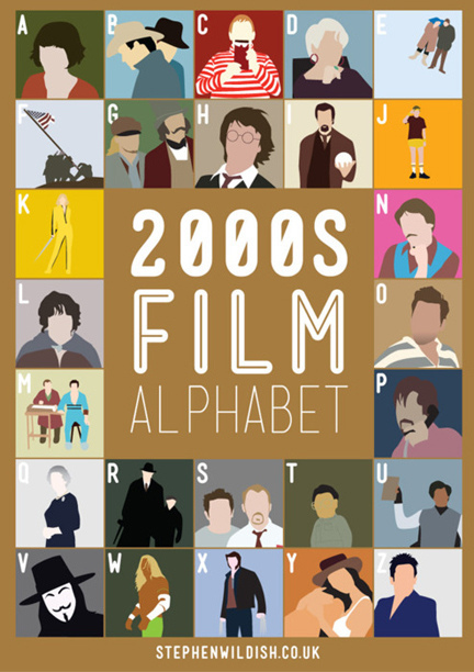
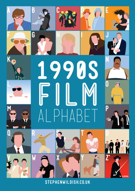
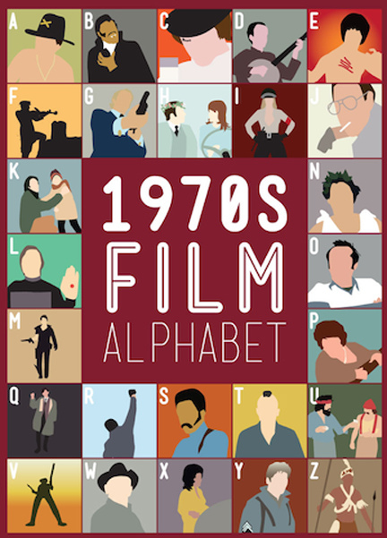
Las redes sociales lo han convertido en la nueva estrella del firmamento web. Es que el diseñador inglés Stephen Wildish tuvo la idea de hacer unos alfabetos donde cada letra coincidía con el nombre de una película de cine moderno. Así uno puede encontrar los alfabetos armados con filmes de los 60, 70, 80 y 90. Este poder de síntesis de convertir una película en una única imagen nos llevó a entrevistarlo, en forma exclusiva para Visualmente, para sumarlo a nuestra sección Minimalismo. Él dedica sus fines de semana para trabajar en este tipo de ideas, los llamados “Proyectos de viernes”.
1. How he came to an alphabet based on movies?
It was after I had made an alphabet based on christmas items, I had a yearning to draw Marty Mcfly from Back to the Future....
2. I worked to achieve such a synthesis? Which illustration was the most complicated?
Honey I shrunk the kids, I'm still not happy with it, looks dreadful!
3. What was the criterion for selecting the characters?
I choose the ones that come across in the simplest way possible. In as fewer shapes and colours as I can

4. How long it took to do this work?
I normally work over the week for about 3-4 hours on each one, that includes finding all my source images!
5. What is the picture that you like best? Why?
Weird Science, I love that film and it's a very good shot to work with ;)
6. Why did you choose the decades of the 60, 80 and 90?
I started with the 80s, the 90s followed on naturally, I chose the 60's though because of the amount of brilliant films there was to chose fro
7. You will make an alphabet of 70 movies?
I have made the 70s alphabet, have a look on here: http://www.stephenwildish.co.uk/friday.html and I am working on the 00s this evening!
- Lo Mejor 2012: Te Presentamos La Ren & Stimpy Type
En agosto, All The Pretty Colors, estudio de diseño con base en Austin, Texas, se sacó el gusto e hizo una fuente basada en la estética bizarra de las series animadas Ren & Stimpy y Aaahh! Real Monsters, pensamos en una entrevista. A continuación,...
- Lo Mejor 2012: Ty Lettau Nos Muestra Sus Versiones Chibis De Dark Vader Y Mario Bros
Mucho no le gusta que le digan minimalista, ni ilustrador. Confiesa que es malo dibujando, pero su poder de síntesis lo llevo a la fama efímera de las redes. Este profesional de Adobe, que irrumpió en varios sitios de diseño por sus portadas de discos...
- Exclusivo: Te Presentamos La Ren & Stimpy Type
Él no es un tipógrafo consagrado. Pero el norteamericano Nathan Walker ha saltado a la popularidad por inventar una tipografía basada en la estética bizarra de las series animadas Ren & Stimpy y Aaahh! Real Monsters. Desde su estudio All The Pretty...
- Exclusivo: Te Presentamos A Alex Gross
Vive en LA, California. Dice su bio, como dato resaltado, que su paso por el Art Center College of Design de Pasadena fue clave en su formación. Es que Alex Gross ya tiene una historia en el arte nuevo de norteamericano con una visión icónica e irónica...
- Exclusivo: Lo último Del Francés Ty Lettau
1. How this project is born pop / geek culture illustration? Well, it started as something different, actually. I did the Animals set first. The original goal was to see how few geometric parts I could use to make an animal face... with the intent of...
Artes Visuales
Exclusivo: Hablamos con el inglés Stephen Wildish
Las redes sociales lo han convertido en la nueva estrella del firmamento web. Es que el diseñador inglés Stephen Wildish tuvo la idea de hacer unos alfabetos donde cada letra coincidía con el nombre de una película de cine moderno. Así uno puede encontrar los alfabetos armados con filmes de los 60, 70, 80 y 90. Este poder de síntesis de convertir una película en una única imagen nos llevó a entrevistarlo, en forma exclusiva para Visualmente, para sumarlo a nuestra sección Minimalismo. Él dedica sus fines de semana para trabajar en este tipo de ideas, los llamados “Proyectos de viernes”.
1. How he came to an alphabet based on movies?
It was after I had made an alphabet based on christmas items, I had a yearning to draw Marty Mcfly from Back to the Future....
2. I worked to achieve such a synthesis? Which illustration was the most complicated?
Honey I shrunk the kids, I'm still not happy with it, looks dreadful!
3. What was the criterion for selecting the characters?
I choose the ones that come across in the simplest way possible. In as fewer shapes and colours as I can
4. How long it took to do this work?
I normally work over the week for about 3-4 hours on each one, that includes finding all my source images!
5. What is the picture that you like best? Why?
Weird Science, I love that film and it's a very good shot to work with ;)
6. Why did you choose the decades of the 60, 80 and 90?
I started with the 80s, the 90s followed on naturally, I chose the 60's though because of the amount of brilliant films there was to chose fro
7. You will make an alphabet of 70 movies?
I have made the 70s alphabet, have a look on here: http://www.stephenwildish.co.uk/friday.html and I am working on the 00s this evening!
- Lo Mejor 2012: Te Presentamos La Ren & Stimpy Type
En agosto, All The Pretty Colors, estudio de diseño con base en Austin, Texas, se sacó el gusto e hizo una fuente basada en la estética bizarra de las series animadas Ren & Stimpy y Aaahh! Real Monsters, pensamos en una entrevista. A continuación,...
- Lo Mejor 2012: Ty Lettau Nos Muestra Sus Versiones Chibis De Dark Vader Y Mario Bros
Mucho no le gusta que le digan minimalista, ni ilustrador. Confiesa que es malo dibujando, pero su poder de síntesis lo llevo a la fama efímera de las redes. Este profesional de Adobe, que irrumpió en varios sitios de diseño por sus portadas de discos...
- Exclusivo: Te Presentamos La Ren & Stimpy Type
Él no es un tipógrafo consagrado. Pero el norteamericano Nathan Walker ha saltado a la popularidad por inventar una tipografía basada en la estética bizarra de las series animadas Ren & Stimpy y Aaahh! Real Monsters. Desde su estudio All The Pretty...
- Exclusivo: Te Presentamos A Alex Gross
Vive en LA, California. Dice su bio, como dato resaltado, que su paso por el Art Center College of Design de Pasadena fue clave en su formación. Es que Alex Gross ya tiene una historia en el arte nuevo de norteamericano con una visión icónica e irónica...
- Exclusivo: Lo último Del Francés Ty Lettau
1. How this project is born pop / geek culture illustration? Well, it started as something different, actually. I did the Animals set first. The original goal was to see how few geometric parts I could use to make an animal face... with the intent of...