Artes Visuales
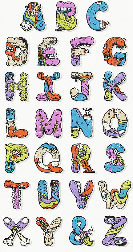
Él no es un tipógrafo consagrado. Pero el norteamericano Nathan Walker ha saltado a la popularidad por inventar una tipografía basada en la estética bizarra de las series animadas Ren & Stimpy y Aaahh! Real Monsters.
Desde su estudio All The Pretty Colors, con base en Austin, Texas, Walker nos cuenta cómo se le ocurrió crear la Alphabetcha y armar una letra N con una pierna que deja ver la punta del femur.

1. How did you come to a font where the letter N is transformed into a broken leg bone showing?
The alphabet came about while sitting in a medical school library with my girlfriend while she studied. I had always wanted to create the alphabet in what I consider my style, and I needed to do something to pass the time, so I just started sketching. The sort of drippy mouths, tongues and body parts tend to come naturally when I'm sketching, so it was just a matter of shaping that into letters.

2. How long did it take to complete the alphabet and the letter which was more complex to achieve?
I worked on the alphabet whenever I had free time in between my full time job and freelance projects. Overall, it spanned over 4 months of slowly chipping away at each letter. There wasn't necessarily one letter more complex to work on than others, but for some reason I kept putting off working on the letter F. It just didn't feel like a fun letter to think about, so I just skipped over it until I was ready.

3. How did the process work? First did pencil drawings and then you went to Illustrator?
All my vector illustrations start off as rather loose sketches with a pencil and paper. I sketched A through M first, minus F, then scanned it to my computer. I took that into illustrator and started to outline the shapes and give it some color. Whenever I would get tired of working on the computer, I would get the sketchbook out and start illustrating the second half of the alphabet. It definitely helped to break the project up so I wasn't staring at the computer all the time.
4. What inspired you most of the animated series Ren & Stimpy?
I was really inspired by the shapes and roundness of the characters. It all seemed rather soft and mushy. I think that helped to enhance the gross feeling the show exuded.


5. What is the letter did you like drawing? Why?
Letters B and G are probably my favorite. I like the level of creativity in them and they easily came together when I put the pencil to the paper. Plus, it's always fun to draw mouths and tongues. The ampersand is another good one. I'm working on creating a series of different ampersands in my free time. It's just a matter of finding the time!

- Lo Mejor 2012: Haciendo Typogami
No es un tipógrafo consagrado. Pero el holandés Jeroen Krielaars es muy creativo. Desde su estudio, Calango de Amsterdam, Holanda, este especialista en motion graphics, había creado la "Typogami". Como su nombre lo indica era una tipografía inspirada...
- Exclusivo: Esta Es La Typogami
Te lo habíamos prometido y hoy cumplimos. En las redes explotó una tipografía basada en el viejo arte japonés de doblar papeles. Se llama Typogami y es una font animada que creó el diseñador o holandés Jeroen Krielaars, del estudio Calango....
- Exclusivo: Esta Semana Vas A Conocer La Typogami Y La Alphabetcha, Dos Tipografías Bien Freakis
Ellos no son tipógrafos consagrados. Uno es el holandés Jeroen Krielaars, el otro, el norteamericano Nathan Walker. Los dos son diseñadores y han creado unas tipografías bastante freakis. Por ejemplo, el Estudio Calango de Amsterdam, Holanda, especializado...
- Exclusivo: Hablamos Con Albert Exergian
Después de conocer los posters de películas del brasileño Pedro Vidotto, y de haber charlado con él, te vamos a presentar, a continuación, a otro ilustrador que también trabaja conceptos muy claros a la hora de hacer un afiche. Es que el trabajo...
- Exclusivo: Hablamos Con Malika Favre Y Anne Brassier, De La Inglesa Airside
(Anne Brassier es la primera empezando de la izquierda, mientras que Malika Favre es la quinta, enfundada en su remera negra) Mientras que muchos blogs replican una y otra vez el alfabeto creado por Airside para la revista inglesa Wallpaper de este mes,...
Artes Visuales
Exclusivo: Te presentamos la Ren & Stimpy Type
Él no es un tipógrafo consagrado. Pero el norteamericano Nathan Walker ha saltado a la popularidad por inventar una tipografía basada en la estética bizarra de las series animadas Ren & Stimpy y Aaahh! Real Monsters.
Desde su estudio All The Pretty Colors, con base en Austin, Texas, Walker nos cuenta cómo se le ocurrió crear la Alphabetcha y armar una letra N con una pierna que deja ver la punta del femur.
1. How did you come to a font where the letter N is transformed into a broken leg bone showing?
The alphabet came about while sitting in a medical school library with my girlfriend while she studied. I had always wanted to create the alphabet in what I consider my style, and I needed to do something to pass the time, so I just started sketching. The sort of drippy mouths, tongues and body parts tend to come naturally when I'm sketching, so it was just a matter of shaping that into letters.
2. How long did it take to complete the alphabet and the letter which was more complex to achieve?
I worked on the alphabet whenever I had free time in between my full time job and freelance projects. Overall, it spanned over 4 months of slowly chipping away at each letter. There wasn't necessarily one letter more complex to work on than others, but for some reason I kept putting off working on the letter F. It just didn't feel like a fun letter to think about, so I just skipped over it until I was ready.
3. How did the process work? First did pencil drawings and then you went to Illustrator?
All my vector illustrations start off as rather loose sketches with a pencil and paper. I sketched A through M first, minus F, then scanned it to my computer. I took that into illustrator and started to outline the shapes and give it some color. Whenever I would get tired of working on the computer, I would get the sketchbook out and start illustrating the second half of the alphabet. It definitely helped to break the project up so I wasn't staring at the computer all the time.
4. What inspired you most of the animated series Ren & Stimpy?
I was really inspired by the shapes and roundness of the characters. It all seemed rather soft and mushy. I think that helped to enhance the gross feeling the show exuded.
5. What is the letter did you like drawing? Why?
Letters B and G are probably my favorite. I like the level of creativity in them and they easily came together when I put the pencil to the paper. Plus, it's always fun to draw mouths and tongues. The ampersand is another good one. I'm working on creating a series of different ampersands in my free time. It's just a matter of finding the time!
- Lo Mejor 2012: Haciendo Typogami
No es un tipógrafo consagrado. Pero el holandés Jeroen Krielaars es muy creativo. Desde su estudio, Calango de Amsterdam, Holanda, este especialista en motion graphics, había creado la "Typogami". Como su nombre lo indica era una tipografía inspirada...
- Exclusivo: Esta Es La Typogami
Te lo habíamos prometido y hoy cumplimos. En las redes explotó una tipografía basada en el viejo arte japonés de doblar papeles. Se llama Typogami y es una font animada que creó el diseñador o holandés Jeroen Krielaars, del estudio Calango....
- Exclusivo: Esta Semana Vas A Conocer La Typogami Y La Alphabetcha, Dos Tipografías Bien Freakis
Ellos no son tipógrafos consagrados. Uno es el holandés Jeroen Krielaars, el otro, el norteamericano Nathan Walker. Los dos son diseñadores y han creado unas tipografías bastante freakis. Por ejemplo, el Estudio Calango de Amsterdam, Holanda, especializado...
- Exclusivo: Hablamos Con Albert Exergian
Después de conocer los posters de películas del brasileño Pedro Vidotto, y de haber charlado con él, te vamos a presentar, a continuación, a otro ilustrador que también trabaja conceptos muy claros a la hora de hacer un afiche. Es que el trabajo...
- Exclusivo: Hablamos Con Malika Favre Y Anne Brassier, De La Inglesa Airside
(Anne Brassier es la primera empezando de la izquierda, mientras que Malika Favre es la quinta, enfundada en su remera negra) Mientras que muchos blogs replican una y otra vez el alfabeto creado por Airside para la revista inglesa Wallpaper de este mes,...