Artes Visuales
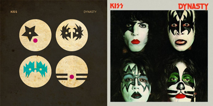
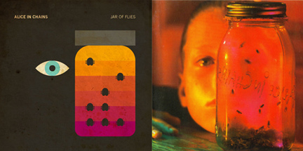
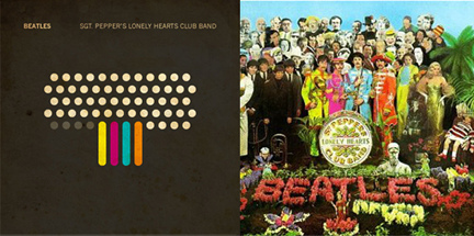
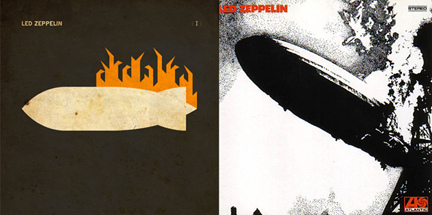
 Mucho no le gusta que le digan minimalista, ni ilustrador. Confiesa que es malo dibujando, pero su poder de síntesis lo llevo a la fama efímera del bloggismo. Este profesional de Adobe irrumpió en varios sitios de diseño por sus versiones de los discos más emblemáticos del rock y pop internacional. Hoy, en exclusiva para Visualmente, Ty Lettau nos habla de sus versiones de Sgt. Pepper's Lonely Hearts Club Band y de Dark Side Of The Moon, antes que en otros blogs.
1. How did the idea of doing these album covers?
Well, I had been playing around with another project which explored translating famous works of art into colored grids. I began applying that method to Album Covers to see what might be different between "commercial design" and these works of art. It didn't work as well for Albums, but I was excited by the idea of doing something with them, so the concept morphed into illustrations rather than visualizations of information.
2. How was the creative process to reach such a synthesis?
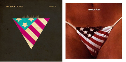
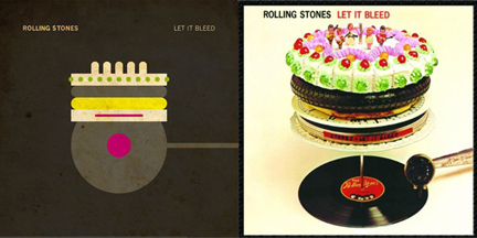
The only real challenge was distilling the covers down to their essence. It wasn't so much about "minimalism" (and for the record, the blogs said that word, I never labelled them that)... it was more about making them similarly "graphic". Taking a photo cover (like Sergeant Pepper) and an already graphic cover (like Dark Side) and getting to a style that could render them mostly the same was challenging. I actually think the more clever ones are the ones I had to work harder on, and the viewer needs to try harder to decipher.
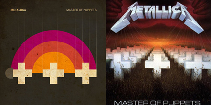
3. How was the selection process of the albums?
It started with deciding the most iconic albums of all time. I quickly realized that "iconic" was not a good enough solitary measure for inclusion... as some iconic covers couldn't work as well in the style I had in mind... whereas other covers that I really wanted to do weren't so iconic. The first one I actually finished was "Master of Puppets" which set the stage for the rest. In the end though, it was just about having some fun with it, so I chose covers that I liked.
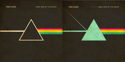
4. Why did two versions of Dark Side of The Moon?
Because there have been several variants to that cover through the years. The blue(ish) one with the additional shape was based on a re-release of the album.
5. What is the cover you like best and why?
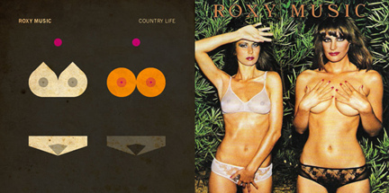
Tough question... I like several most, but for different reasons. I'd say overall favorite is Roxy Music's Country Life... because it's just so perfect. It took a photo, and broke it to the only parts that the viewer really focuses on. That and it's slightly offensive. I also really like Master of Puppets. That album is very dear to me... so I think I like it more because of that. I think Sergeant Pepper's is probably the most clever... as it is the least visually like the original, yet it still works. The Coldplay and Dark Side covers are my least favorite, in that they are so close to the originals... but I included them because I thought they helped the set, as a whole, work.
- Lo Mejor 2012: Ty Lettau Nos Muestra Sus Versiones Chibis De Dark Vader Y Mario Bros
Mucho no le gusta que le digan minimalista, ni ilustrador. Confiesa que es malo dibujando, pero su poder de síntesis lo llevo a la fama efímera de las redes. Este profesional de Adobe, que irrumpió en varios sitios de diseño por sus portadas de discos...
- Lo Mejor Del 2010: Los Afiches Tipográficos De Jerod Gibson
Nos está gustando esto del minimalismo dentro del diseño. Por eso, te lo estuvimos presentando a través de los más recientes referentes de ésta especie de nueva vanguardia. En Visualmente conociste por qué al austriaco Albert Exergian le pareció...
- Exclusivo: Dibujando La Portada De The New Yorker Con Un Iphone
(Portada del último número de The New Yorker) Cuando le preguntamos si usaba fotos en sus ilustraciones para la revista norteamericana The New Yorker, el artista portugués Jorge Colombo se molestó mucho. "The way I work is: I walk around the city,...
- Lo Mejor 2009: Mark Todd Versiona A Iron Man
Su estilo es muy especial y en VisualMente nos gusta mucho. El 10 de marzo te presentamos al artista norteamericano Mark Todd, quien nos habló de sus poderosas portadas de revistas de historietas hechas en un estilo que recuerda Jean-Michel Basquiat....
- Exclusivo: Hablamos Con Mark Todd
Perdonen la tardanza, pero todo llega. Hoy te presentamos al ilustrador norteamericano Mark Todd que ha hecho hablar a màs de un blog con sus recreaciones comiqueras. 1) How you chose the covers of comic magazine? i chose covers i love. covers i can...
Artes Visuales
Exclusivo: Ty Lettau nos habla de sus tapas de discos
Mucho no le gusta que le digan minimalista, ni ilustrador. Confiesa que es malo dibujando, pero su poder de síntesis lo llevo a la fama efímera del bloggismo. Este profesional de Adobe irrumpió en varios sitios de diseño por sus versiones de los discos más emblemáticos del rock y pop internacional. Hoy, en exclusiva para Visualmente, Ty Lettau nos habla de sus versiones de Sgt. Pepper's Lonely Hearts Club Band y de Dark Side Of The Moon, antes que en otros blogs.1. How did the idea of doing these album covers?
Well, I had been playing around with another project which explored translating famous works of art into colored grids. I began applying that method to Album Covers to see what might be different between "commercial design" and these works of art. It didn't work as well for Albums, but I was excited by the idea of doing something with them, so the concept morphed into illustrations rather than visualizations of information.
2. How was the creative process to reach such a synthesis?
The only real challenge was distilling the covers down to their essence. It wasn't so much about "minimalism" (and for the record, the blogs said that word, I never labelled them that)... it was more about making them similarly "graphic". Taking a photo cover (like Sergeant Pepper) and an already graphic cover (like Dark Side) and getting to a style that could render them mostly the same was challenging. I actually think the more clever ones are the ones I had to work harder on, and the viewer needs to try harder to decipher.
3. How was the selection process of the albums?
It started with deciding the most iconic albums of all time. I quickly realized that "iconic" was not a good enough solitary measure for inclusion... as some iconic covers couldn't work as well in the style I had in mind... whereas other covers that I really wanted to do weren't so iconic. The first one I actually finished was "Master of Puppets" which set the stage for the rest. In the end though, it was just about having some fun with it, so I chose covers that I liked.
4. Why did two versions of Dark Side of The Moon?
Because there have been several variants to that cover through the years. The blue(ish) one with the additional shape was based on a re-release of the album.
5. What is the cover you like best and why?
Tough question... I like several most, but for different reasons. I'd say overall favorite is Roxy Music's Country Life... because it's just so perfect. It took a photo, and broke it to the only parts that the viewer really focuses on. That and it's slightly offensive. I also really like Master of Puppets. That album is very dear to me... so I think I like it more because of that. I think Sergeant Pepper's is probably the most clever... as it is the least visually like the original, yet it still works. The Coldplay and Dark Side covers are my least favorite, in that they are so close to the originals... but I included them because I thought they helped the set, as a whole, work.
- Lo Mejor 2012: Ty Lettau Nos Muestra Sus Versiones Chibis De Dark Vader Y Mario Bros
Mucho no le gusta que le digan minimalista, ni ilustrador. Confiesa que es malo dibujando, pero su poder de síntesis lo llevo a la fama efímera de las redes. Este profesional de Adobe, que irrumpió en varios sitios de diseño por sus portadas de discos...
- Lo Mejor Del 2010: Los Afiches Tipográficos De Jerod Gibson
Nos está gustando esto del minimalismo dentro del diseño. Por eso, te lo estuvimos presentando a través de los más recientes referentes de ésta especie de nueva vanguardia. En Visualmente conociste por qué al austriaco Albert Exergian le pareció...
- Exclusivo: Dibujando La Portada De The New Yorker Con Un Iphone
(Portada del último número de The New Yorker) Cuando le preguntamos si usaba fotos en sus ilustraciones para la revista norteamericana The New Yorker, el artista portugués Jorge Colombo se molestó mucho. "The way I work is: I walk around the city,...
- Lo Mejor 2009: Mark Todd Versiona A Iron Man
Su estilo es muy especial y en VisualMente nos gusta mucho. El 10 de marzo te presentamos al artista norteamericano Mark Todd, quien nos habló de sus poderosas portadas de revistas de historietas hechas en un estilo que recuerda Jean-Michel Basquiat....
- Exclusivo: Hablamos Con Mark Todd
Perdonen la tardanza, pero todo llega. Hoy te presentamos al ilustrador norteamericano Mark Todd que ha hecho hablar a màs de un blog con sus recreaciones comiqueras. 1) How you chose the covers of comic magazine? i chose covers i love. covers i can...