Artes Visuales
 Perdonen la tardanza, pero todo llega. Hoy te presentamos al ilustrador norteamericano Mark Todd que ha hecho hablar a màs de un blog con sus recreaciones comiqueras.
1) How you chose the covers of comic magazine?
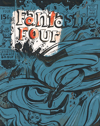
i chose covers i love. covers i can see altered in a interesting way. covers by jack kirby are by far my favorite.
sometimes i choose covers of comics that i remember owning as a teenager, ones that provoke a memory or an emotion.
2) Which technique used to achieve closer to the original font?
once in a while the fonts are transfered down and painted. but most of the time they are just done freehand.
i love type and i enjoy trying to mimic certain fonts, especially the fantastic four title. its such a beautiful script.
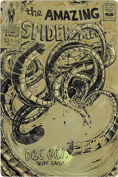
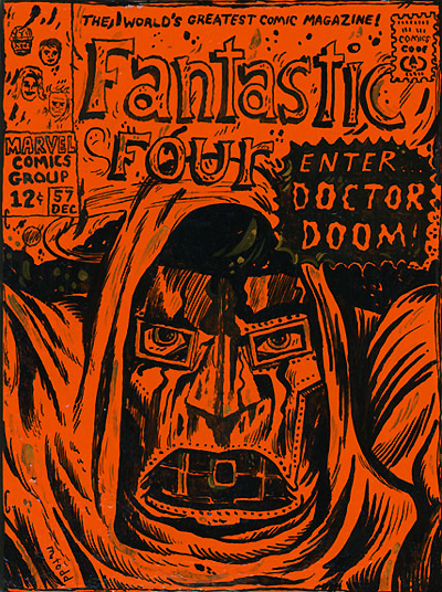
3) How was the choice of colors in the covers of Doctor Doom and Doc Oc?
colors are made based on the mood i want to project onto the pieces. a lot of the color choices are in direct contrast to the original cover art color choices, pinks and neon oranges for example. i like changing the colors dramatically, helping to modernize the painting and emphasize the alterations from comic cover to original art. other times i like to mimic the colors of the comics more directly. it just depends on the mood i'm in and how i feel about the cover at that time.
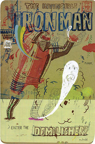
4) On the cover of Demolisher (Iron Man magazine), You use an aesthetic style that is reminiscent of a Jean-Michel Basquiat. This artist has exerted some influence on you?
yes, i suppose so. basquiat was a favorite of mine early on in my career and was probably more apparent then. his linework was beautiful. these days, i am drawn more to artists like Guston and Donald Bachelor.
- Lo Mejor Del 2010: Haciendo La Tapa Del Wallpaper
(Una de las 20.000 portadasque se subieron al sitio) Te contamos que a través de un desarrollo del estudio londinense Kin Design, el lector de la revista Wallpaper*, podía acceder a una paleta especial de recursos visuales creados por artistas del...
- Lo Mejor Del 2010: Los Discos Minimalistas De Ty Lettau
Mucho no le gusta que le digan minimalista, ni ilustrador. Confiesa que es malo dibujando, pero su poder de síntesis lo llevo a la fama efímera del bloggismo. Este profesional de Adobe irrumpió en varios sitios de diseño por sus versiones de los...
- Exclusivo: No Quieres Diseñar La Portada De La Revista Inglesa Wallpaper?
(Una de las 20.000 portadasque se subieron al sitio) Te contamos que a través de un desarrollo del estudio londinense Kin Design, el lector de la revista Wallpaper*, podía acceder a una paleta especial de recursos visuales creados por artistas del...
- Exclusivo: Ty Lettau Nos Habla De Sus Tapas De Discos
Mucho no le gusta que le digan minimalista, ni ilustrador. Confiesa que es malo dibujando, pero su poder de síntesis lo llevo a la fama efímera del bloggismo. Este profesional de Adobe irrumpió en varios sitios de diseño por sus versiones de los...
- Exclusivo: Dibujando La Portada De The New Yorker Con Un Iphone
(Portada del último número de The New Yorker) Cuando le preguntamos si usaba fotos en sus ilustraciones para la revista norteamericana The New Yorker, el artista portugués Jorge Colombo se molestó mucho. "The way I work is: I walk around the city,...
Artes Visuales
Exclusivo: Hablamos con Mark Todd
Perdonen la tardanza, pero todo llega. Hoy te presentamos al ilustrador norteamericano Mark Todd que ha hecho hablar a màs de un blog con sus recreaciones comiqueras. 1) How you chose the covers of comic magazine?
i chose covers i love. covers i can see altered in a interesting way. covers by jack kirby are by far my favorite.
sometimes i choose covers of comics that i remember owning as a teenager, ones that provoke a memory or an emotion.
2) Which technique used to achieve closer to the original font?
once in a while the fonts are transfered down and painted. but most of the time they are just done freehand.
i love type and i enjoy trying to mimic certain fonts, especially the fantastic four title. its such a beautiful script.
3) How was the choice of colors in the covers of Doctor Doom and Doc Oc?
colors are made based on the mood i want to project onto the pieces. a lot of the color choices are in direct contrast to the original cover art color choices, pinks and neon oranges for example. i like changing the colors dramatically, helping to modernize the painting and emphasize the alterations from comic cover to original art. other times i like to mimic the colors of the comics more directly. it just depends on the mood i'm in and how i feel about the cover at that time.
4) On the cover of Demolisher (Iron Man magazine), You use an aesthetic style that is reminiscent of a Jean-Michel Basquiat. This artist has exerted some influence on you?
yes, i suppose so. basquiat was a favorite of mine early on in my career and was probably more apparent then. his linework was beautiful. these days, i am drawn more to artists like Guston and Donald Bachelor.
- Lo Mejor Del 2010: Haciendo La Tapa Del Wallpaper
(Una de las 20.000 portadasque se subieron al sitio) Te contamos que a través de un desarrollo del estudio londinense Kin Design, el lector de la revista Wallpaper*, podía acceder a una paleta especial de recursos visuales creados por artistas del...
- Lo Mejor Del 2010: Los Discos Minimalistas De Ty Lettau
Mucho no le gusta que le digan minimalista, ni ilustrador. Confiesa que es malo dibujando, pero su poder de síntesis lo llevo a la fama efímera del bloggismo. Este profesional de Adobe irrumpió en varios sitios de diseño por sus versiones de los...
- Exclusivo: No Quieres Diseñar La Portada De La Revista Inglesa Wallpaper?
(Una de las 20.000 portadasque se subieron al sitio) Te contamos que a través de un desarrollo del estudio londinense Kin Design, el lector de la revista Wallpaper*, podía acceder a una paleta especial de recursos visuales creados por artistas del...
- Exclusivo: Ty Lettau Nos Habla De Sus Tapas De Discos
Mucho no le gusta que le digan minimalista, ni ilustrador. Confiesa que es malo dibujando, pero su poder de síntesis lo llevo a la fama efímera del bloggismo. Este profesional de Adobe irrumpió en varios sitios de diseño por sus versiones de los...
- Exclusivo: Dibujando La Portada De The New Yorker Con Un Iphone
(Portada del último número de The New Yorker) Cuando le preguntamos si usaba fotos en sus ilustraciones para la revista norteamericana The New Yorker, el artista portugués Jorge Colombo se molestó mucho. "The way I work is: I walk around the city,...