Artes Visuales
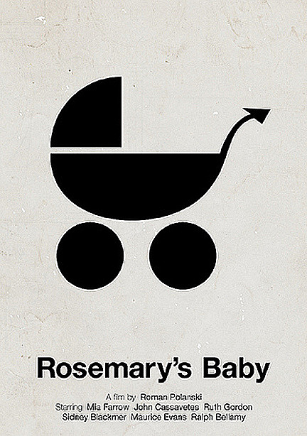
1. How the idea for Pictogram Movie Poster?
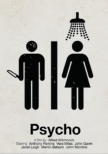
I’ve always loved film and film posters, and also pictograms. So, it was a natural evolution for me to combine these two interests and start a project, doing pictogram movie posters. It was also quite a relief and a great satisfaction, to have a platform and a fixed template to fill with my ideas. This way, I could concentrate on the images and the ideas for a clever pictogram, instead of making decisions about typography and colors and so on. I could be more productive this way, and also make them work as a whole, with no distractions or irregular themes. I think I will keep doing them for a while, and maybe make one hundred and then stop, or something. I really haven’t decided anything. As long as I get good ideas, I will keep doing them.
2. For you, what styles are best accomplished? and why?
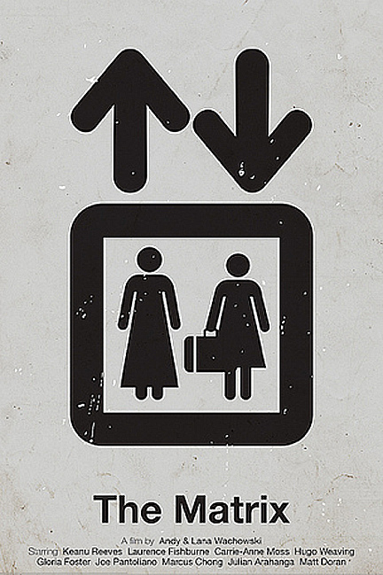
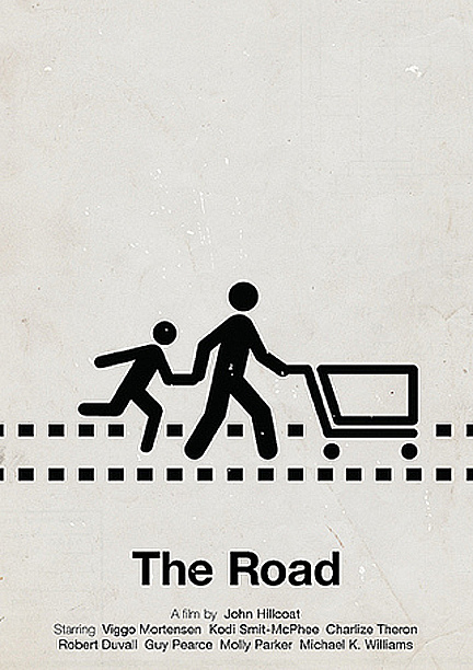
If I got the question right, I really like to be as simple as possible, relying on a strong idea, with as few details and elements as possible. I like to be clever and most of the time minimalist, but that’s not for the sake of it, it’s just a natural choice, because I wouldn’t really know how to do things other ways. I leave the cool and visually stunning 3D stuff to people who are good at that and know how to execute those kinds of designs. I stick to simple 2D images, at least for now. It would be great though, to be able to learn how to do more advanced things, I have ideas today that I can’t execute, so I might leave the minimalist area someday.
3. You worked with a vector drawing program or pre-made sketches in pencil? Also gave a termination in Photoshop which makes it vintage. Why?
I work only in Illustrator, mostly with already existing pictograms or other free vector material. I seldom draw anything by hand by myself, mainly because I suck at it, but also because you don’t need to do that nowadays, there is so much free material out there, which you can transform and remake to something unique and personal.
Yeah, I usually add a grainy and rough texture on top of my posters. This is simply because I feel that they look too clean and soulless and digital, without a texture. Like they come straight from the software. I want them to feel like they’ve been hanging for a long time in a basement somewhere, like they’ve been used and have a history behind them.
4. For example, how was the creative process in the case of Thank you for smoke?
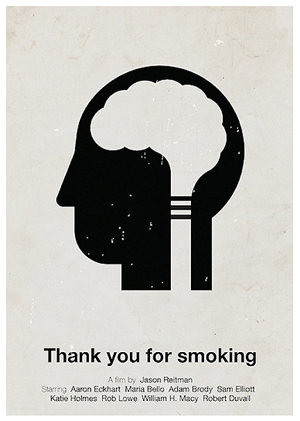
I was looking at the pictogram for ‘neurology’ on The Noun Project, for a long time (this is usually the common process for most of the pictogram movie posters). Then I just thought I could transform it into a cigarette with smoke coming out of it, and make the brain look like the smoke. So, the idea for the transformation came before I decided to make a poster for ‘Thank you for smoking’. It was after the image was done, that I figured I should use it for a pictogram movie poster, and then I thought this film was an appropriate choice. I have quite a few projects with illustrations that aren’t finished, just waiting to get those last details done and maybe get ideas for how and where to use them.
5. How much time does it take you to design one poster?
This really varies, it takes just minutes sometimes, and sometimes I can work on a poster for several days, without finishing them. The pictogram posters are made pretty fast though, they are very simple and don’t need that much work after I get the idea. I always feel that the idea is the most important thing, I seldom start working without having an idea, although I do sketch and try different things before I get on the right track. It usually takes more time to just sit and look at images and try to come up with an idea. The actual time to get the vectors sorted out and placing them at the right places is often not very hard, and doesn’t take very long. I really like being productive and publish works as soon as possible, I’m a bit impatient and want to get feedback on my stuff as fast as possible. It’s almost like drug for me, to bring my ideas to life and then get feedback and comments on it. It’s such a great motivation to read nice things about your work and that it’s appreciated, it really motivates me to keep working.
- Lo Mejor 2011: Exclusivo, Te Presentamos Al Ilustrador Alex Bloom
No muchos conocen El Alamo Drafthouse Cinema. Ni los sitios de diseño que levantan sus afiches de cine, sin informar de dónde son ni quiénes los hacen. El Alamo es una sala de cine, ubicada en Austin, Texas, que se especializa en proyectar películas...
- Lo Mejor 2011: Exclusivo, Viktor Hertz Nos Presenta Sus Pictogram Movie Poster
En abril pasado, te presentamos, en primicia latina, al diseñador sueco Viktor Hertz quien se había metido con los íconos típicos que se usan en los baños para hacer sus afiches de cine. En aquel momento, nadie lo había entrevistado, pero todos...
- Exclusivo: Te Presentamos Al Ilustrador Norteamericano Alex Bloom
No muchos conocen El Alamo Drafthouse Cinema. Ni los sitios de diseño que levantan sus afiches de cine, sin informar de dónde son ni quiénes los hacen. El Alamo es una sala de cine, ubicada en Austin, Texas, que se especializa en proyectar películas...
- Lo Mejor Del 2010: The Style Of Music De James-alexander Mathers
(photo: Alex Browne / EZASA2B) Hablamos con el artista canadiense James-Alexander Mathers, responsable de una serie de afiches que trata de mostrar los distintos estilos de música a través de su estilo de vestimenta. Una experiencia muy cercana a...
- Exclusivo: Te Presentamos Ensemble, The Style Of Music
(photo: Alex Browne / EZASA2B) Hablamos con el artista canadiense James-Alexander Mathers, responsable de una serie de afiches que trata de mostrar los distintos estilos de música a través de su estilo de vestimenta. Una experiencia muy cercana a lo...
Artes Visuales
Exclusivo: Viktor Hertz nos presenta sus Pictogram Movie Poster

1. How the idea for Pictogram Movie Poster?
I’ve always loved film and film posters, and also pictograms. So, it was a natural evolution for me to combine these two interests and start a project, doing pictogram movie posters. It was also quite a relief and a great satisfaction, to have a platform and a fixed template to fill with my ideas. This way, I could concentrate on the images and the ideas for a clever pictogram, instead of making decisions about typography and colors and so on. I could be more productive this way, and also make them work as a whole, with no distractions or irregular themes. I think I will keep doing them for a while, and maybe make one hundred and then stop, or something. I really haven’t decided anything. As long as I get good ideas, I will keep doing them.


2. For you, what styles are best accomplished? and why?
If I got the question right, I really like to be as simple as possible, relying on a strong idea, with as few details and elements as possible. I like to be clever and most of the time minimalist, but that’s not for the sake of it, it’s just a natural choice, because I wouldn’t really know how to do things other ways. I leave the cool and visually stunning 3D stuff to people who are good at that and know how to execute those kinds of designs. I stick to simple 2D images, at least for now. It would be great though, to be able to learn how to do more advanced things, I have ideas today that I can’t execute, so I might leave the minimalist area someday.
3. You worked with a vector drawing program or pre-made sketches in pencil? Also gave a termination in Photoshop which makes it vintage. Why?
I work only in Illustrator, mostly with already existing pictograms or other free vector material. I seldom draw anything by hand by myself, mainly because I suck at it, but also because you don’t need to do that nowadays, there is so much free material out there, which you can transform and remake to something unique and personal.
Yeah, I usually add a grainy and rough texture on top of my posters. This is simply because I feel that they look too clean and soulless and digital, without a texture. Like they come straight from the software. I want them to feel like they’ve been hanging for a long time in a basement somewhere, like they’ve been used and have a history behind them.

4. For example, how was the creative process in the case of Thank you for smoke?
I was looking at the pictogram for ‘neurology’ on The Noun Project, for a long time (this is usually the common process for most of the pictogram movie posters). Then I just thought I could transform it into a cigarette with smoke coming out of it, and make the brain look like the smoke. So, the idea for the transformation came before I decided to make a poster for ‘Thank you for smoking’. It was after the image was done, that I figured I should use it for a pictogram movie poster, and then I thought this film was an appropriate choice. I have quite a few projects with illustrations that aren’t finished, just waiting to get those last details done and maybe get ideas for how and where to use them.

5. How much time does it take you to design one poster?
This really varies, it takes just minutes sometimes, and sometimes I can work on a poster for several days, without finishing them. The pictogram posters are made pretty fast though, they are very simple and don’t need that much work after I get the idea. I always feel that the idea is the most important thing, I seldom start working without having an idea, although I do sketch and try different things before I get on the right track. It usually takes more time to just sit and look at images and try to come up with an idea. The actual time to get the vectors sorted out and placing them at the right places is often not very hard, and doesn’t take very long. I really like being productive and publish works as soon as possible, I’m a bit impatient and want to get feedback on my stuff as fast as possible. It’s almost like drug for me, to bring my ideas to life and then get feedback and comments on it. It’s such a great motivation to read nice things about your work and that it’s appreciated, it really motivates me to keep working.

- Lo Mejor 2011: Exclusivo, Te Presentamos Al Ilustrador Alex Bloom
No muchos conocen El Alamo Drafthouse Cinema. Ni los sitios de diseño que levantan sus afiches de cine, sin informar de dónde son ni quiénes los hacen. El Alamo es una sala de cine, ubicada en Austin, Texas, que se especializa en proyectar películas...
- Lo Mejor 2011: Exclusivo, Viktor Hertz Nos Presenta Sus Pictogram Movie Poster
En abril pasado, te presentamos, en primicia latina, al diseñador sueco Viktor Hertz quien se había metido con los íconos típicos que se usan en los baños para hacer sus afiches de cine. En aquel momento, nadie lo había entrevistado, pero todos...
- Exclusivo: Te Presentamos Al Ilustrador Norteamericano Alex Bloom
No muchos conocen El Alamo Drafthouse Cinema. Ni los sitios de diseño que levantan sus afiches de cine, sin informar de dónde son ni quiénes los hacen. El Alamo es una sala de cine, ubicada en Austin, Texas, que se especializa en proyectar películas...
- Lo Mejor Del 2010: The Style Of Music De James-alexander Mathers
(photo: Alex Browne / EZASA2B) Hablamos con el artista canadiense James-Alexander Mathers, responsable de una serie de afiches que trata de mostrar los distintos estilos de música a través de su estilo de vestimenta. Una experiencia muy cercana a...
- Exclusivo: Te Presentamos Ensemble, The Style Of Music
(photo: Alex Browne / EZASA2B) Hablamos con el artista canadiense James-Alexander Mathers, responsable de una serie de afiches que trata de mostrar los distintos estilos de música a través de su estilo de vestimenta. Una experiencia muy cercana a lo...
