Artes Visuales

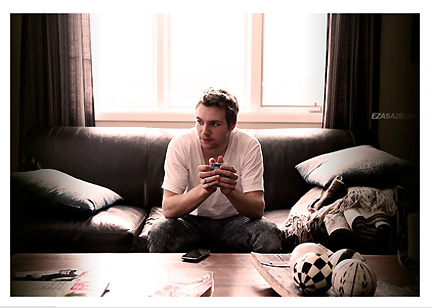
(photo: Alex Browne / EZASA2B)
Hablamos con el artista canadiense James-Alexander Mathers, responsable de una serie de afiches que trata de mostrar los distintos estilos de música a través de su estilo de vestimenta. Una experiencia muy cercana a lo que veníamos registrando en nuestras entrevistas a artistas del mundo que han adoptado el estilo minimalista como propio.
1. How the idea for Ensemble, The Style of Music?
Moxy Creative came up with the idea for Ensemble in order to promote their newest website Everyguyed. We're always looking to create interesting viral posters, and one of the ways we do that is by pairing our interests. Of course fashion is the main focus of Everyguyed, but we're also interested in popular culture, movies and music. What we love is when we find one within the other; in this case we found some really extraordinary examples of fashion within the music industry.
2. How was the work of documentation to know how to differentiate the different styles of clothes?
Glenn Michael from Moxy spent a lot of time sourcing outfits and choosing from a long list of artists. Originally we had around 40 different musicians with two or three outfits each, before we narrowed it down to the 20 which stood out from one another.
3. Which was the most complex styles to achieve? and why?
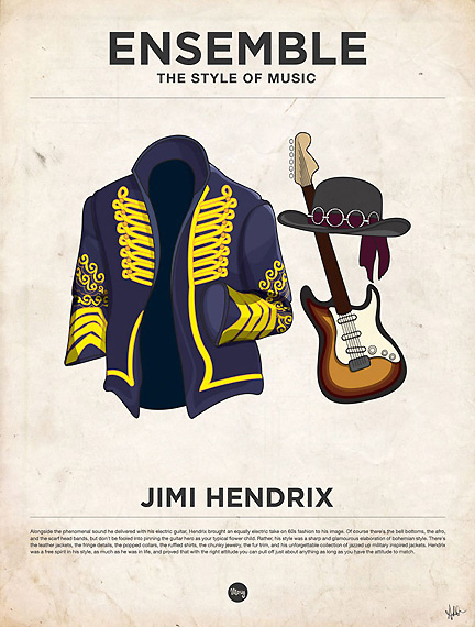
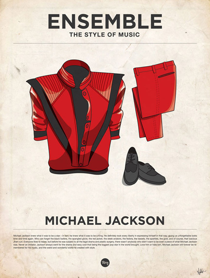
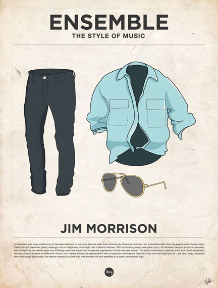
There were a couple styles which were very difficult to achieve. Some of them were difficult from a technical standpoint such as Jimi Hendrix and Michael Jackson, because of the intricate costumes and the detail that had to be used to draw them properly. Others like Jim Morrison were difficult because they used very common pieces of clothing, but they had to represent a very specific person.
4. For you, what styles are best accomplished? and why?
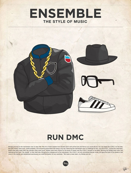
My favorite outfit changes all the time, but I've always liked the RUN DMC outfit because every piece is entirely unique to that band, not just one or two of the three items.
5. How to chose the musicians and musical styles?
Glenn Michael was in charge of picking the outfits to represent each artist. He was very careful about which artists we chose to represent, and which outfits were the most iconic. It was extremely hard to narrow down the list to 20 musicians, but we wanted to have as many different artists as we could, without having too many styles which were similar. We wanted to represent all areas of music and fashion.
6. You worked with a vector drawing program or pre-made sketches in pencil? Also gave a termination in Photoshop which makes it vintage. Why?
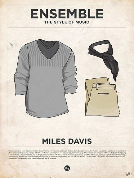
When I was working with Moxy Creative, I spent 95% of my time in Illustrator, so it was natural to work with that from the start. There were no initial sketches, but the style continued to evolve throughout working on the piece. As for the vintage finish, we simply wanted to pay homage to the classic appeal of the outfits. They aren't necessarily in style today, but we think they'll always be remembered for great fashion sense.
7. How long it took to make each of the styles?
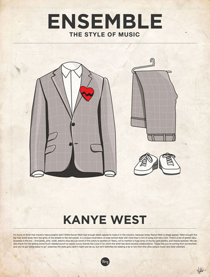
In the beginning each outfit would take me a very long time. Typically five to six hours for each one. But as I continued to work and the final style became more resolved I was able to do the majority of an outfit in three or four hours. The whole project took over a month to illustrate, and probably two or three months from concept to print. It was really hard to decide when each outfit was finished because the outfits we chose had so many great and iconic details that we didn't want to leave anything out.
Si querés ver más, entrá en Chillart, el blog de arte de Visualmente.
- Lo Mejor 2011: Exclusivo, Te Presentamos Al Ilustrador Alex Bloom
No muchos conocen El Alamo Drafthouse Cinema. Ni los sitios de diseño que levantan sus afiches de cine, sin informar de dónde son ni quiénes los hacen. El Alamo es una sala de cine, ubicada en Austin, Texas, que se especializa en proyectar películas...
- Exclusivo: El Sueco Viktor Hertz Nos Presenta Sus Pictogram Music Posters
En abril pasado, te presentamos, en primicia latina, al diseñador sueco Viktor Hertz quien se había metido con los íconos típicos que se usan en los baños para hacer sus afiches de cine. En aquel momento, nadie lo había entrevistado, pero todos...
- Exclusivo: Te Presentamos Al Ilustrador Norteamericano Alex Bloom
No muchos conocen El Alamo Drafthouse Cinema. Ni los sitios de diseño que levantan sus afiches de cine, sin informar de dónde son ni quiénes los hacen. El Alamo es una sala de cine, ubicada en Austin, Texas, que se especializa en proyectar películas...
- Exclusivo: Viktor Hertz Nos Presenta Sus Pictogram Movie Poster
1. How the idea for Pictogram Movie Poster? I’ve always loved film and film posters, and also pictograms. So, it was a natural evolution for me to combine these two interests and start a project, doing pictogram movie posters. It was also quite a...
- Minimalismo: Hoy. Tom Wahlin
1. How the idea for Music For The Masses? Music For The Masses was a project my senior year of school in advanced typography class. All of the content was provided. The purpose: To create variety while keeping a consistent theme: "Basilica Block Party."...
Artes Visuales
Lo Mejor del 2010: The Style of Music de James-Alexander Mathers


(photo: Alex Browne / EZASA2B)
Hablamos con el artista canadiense James-Alexander Mathers, responsable de una serie de afiches que trata de mostrar los distintos estilos de música a través de su estilo de vestimenta. Una experiencia muy cercana a lo que veníamos registrando en nuestras entrevistas a artistas del mundo que han adoptado el estilo minimalista como propio.
1. How the idea for Ensemble, The Style of Music?
Moxy Creative came up with the idea for Ensemble in order to promote their newest website Everyguyed. We're always looking to create interesting viral posters, and one of the ways we do that is by pairing our interests. Of course fashion is the main focus of Everyguyed, but we're also interested in popular culture, movies and music. What we love is when we find one within the other; in this case we found some really extraordinary examples of fashion within the music industry.
2. How was the work of documentation to know how to differentiate the different styles of clothes?
Glenn Michael from Moxy spent a lot of time sourcing outfits and choosing from a long list of artists. Originally we had around 40 different musicians with two or three outfits each, before we narrowed it down to the 20 which stood out from one another.


3. Which was the most complex styles to achieve? and why?
There were a couple styles which were very difficult to achieve. Some of them were difficult from a technical standpoint such as Jimi Hendrix and Michael Jackson, because of the intricate costumes and the detail that had to be used to draw them properly. Others like Jim Morrison were difficult because they used very common pieces of clothing, but they had to represent a very specific person.

4. For you, what styles are best accomplished? and why?
My favorite outfit changes all the time, but I've always liked the RUN DMC outfit because every piece is entirely unique to that band, not just one or two of the three items.
5. How to chose the musicians and musical styles?
Glenn Michael was in charge of picking the outfits to represent each artist. He was very careful about which artists we chose to represent, and which outfits were the most iconic. It was extremely hard to narrow down the list to 20 musicians, but we wanted to have as many different artists as we could, without having too many styles which were similar. We wanted to represent all areas of music and fashion.

6. You worked with a vector drawing program or pre-made sketches in pencil? Also gave a termination in Photoshop which makes it vintage. Why?
When I was working with Moxy Creative, I spent 95% of my time in Illustrator, so it was natural to work with that from the start. There were no initial sketches, but the style continued to evolve throughout working on the piece. As for the vintage finish, we simply wanted to pay homage to the classic appeal of the outfits. They aren't necessarily in style today, but we think they'll always be remembered for great fashion sense.

7. How long it took to make each of the styles?
In the beginning each outfit would take me a very long time. Typically five to six hours for each one. But as I continued to work and the final style became more resolved I was able to do the majority of an outfit in three or four hours. The whole project took over a month to illustrate, and probably two or three months from concept to print. It was really hard to decide when each outfit was finished because the outfits we chose had so many great and iconic details that we didn't want to leave anything out.
Si querés ver más, entrá en Chillart, el blog de arte de Visualmente.
- Lo Mejor 2011: Exclusivo, Te Presentamos Al Ilustrador Alex Bloom
No muchos conocen El Alamo Drafthouse Cinema. Ni los sitios de diseño que levantan sus afiches de cine, sin informar de dónde son ni quiénes los hacen. El Alamo es una sala de cine, ubicada en Austin, Texas, que se especializa en proyectar películas...
- Exclusivo: El Sueco Viktor Hertz Nos Presenta Sus Pictogram Music Posters
En abril pasado, te presentamos, en primicia latina, al diseñador sueco Viktor Hertz quien se había metido con los íconos típicos que se usan en los baños para hacer sus afiches de cine. En aquel momento, nadie lo había entrevistado, pero todos...
- Exclusivo: Te Presentamos Al Ilustrador Norteamericano Alex Bloom
No muchos conocen El Alamo Drafthouse Cinema. Ni los sitios de diseño que levantan sus afiches de cine, sin informar de dónde son ni quiénes los hacen. El Alamo es una sala de cine, ubicada en Austin, Texas, que se especializa en proyectar películas...
- Exclusivo: Viktor Hertz Nos Presenta Sus Pictogram Movie Poster
1. How the idea for Pictogram Movie Poster? I’ve always loved film and film posters, and also pictograms. So, it was a natural evolution for me to combine these two interests and start a project, doing pictogram movie posters. It was also quite a...
- Minimalismo: Hoy. Tom Wahlin
1. How the idea for Music For The Masses? Music For The Masses was a project my senior year of school in advanced typography class. All of the content was provided. The purpose: To create variety while keeping a consistent theme: "Basilica Block Party."...
