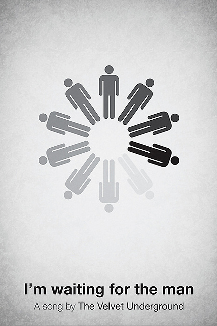
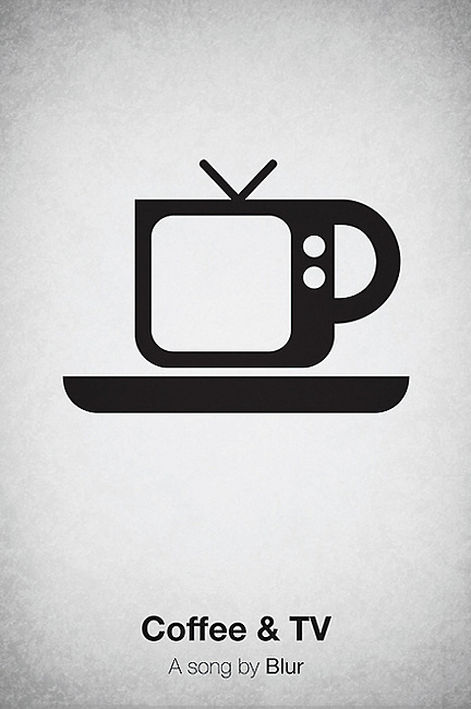
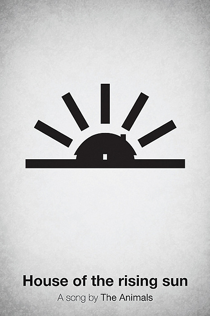
Artes Visuales
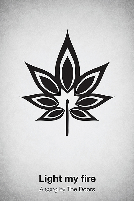
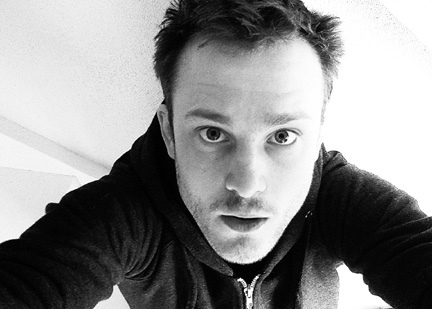
En abril pasado, te presentamos, en primicia latina, al diseñador sueco Viktor Hertz quien se había metido con los íconos típicos que se usan en los baños para hacer sus afiches de cine. En aquel momento, nadie lo había entrevistado, pero todos los blogs habían copiado y pegado sus versiones de famosas películas. Hoy aumentamos la apuesta y antes de que sean un éxito en las redes, te presentamos los "Pictogram music posters", lo último de Hertz. Y, como no podía ser de otra manera, no sólo te los mostramos, sino que entrevistamos, por segunda vez, a su creador, en exclusiva para Visualmente.
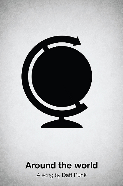
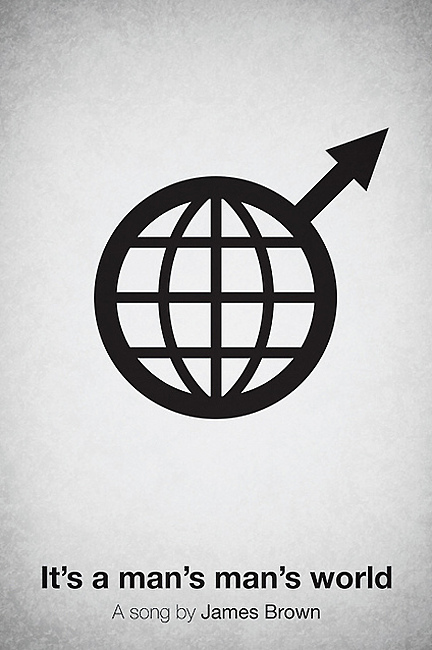
1) How the idea for "Pictogram music posters"?
A long time ago, I had an idea of making posters out of songs, but not by using pictograms. I never made these posters, and then my mom actually told me I should make music posters, and I thought the most appropriate way to do them was using pictograms. Si querés ver más Pictogram Movie Poster, entra ya a Chillart, el blog de arte de Visualmente.
2) How you relate to your previous Pictogram Movie Poster?
It’s the exact same idea, but song titles instead of movies. That’s it. I wanted these to differ from the movie posters, though, so I just experimented with a different texture and background. I did keep the centered Helvetica font, continuing with the simple approach and aesthetics.
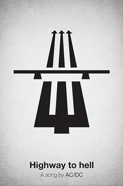
3) How did you get your version of Highway to hell?
It began with being reminded of the song, or maybe I was just looking at the symbol for the autobahn, I can’t really remember now, actually. But it seemed appropriate, so I played around with different versions of a trident, and finally came up with this draft. I thought the best symbol depicting hell was a trident, in this case.
4) Which of all the new posters was the most complicated?
It was actually ‘Highway to hell’, which I described in the previous question. It took quite a while to get it right, making the trident look good, and not get too far away from the original pictogram. It was also the most fun to make, and even one of the posters I am most happy with. So, it was worth the effort, I guess.
5) How long did it take to make the posters?
I’ve had them finished on my computer for quite a while, going back and polishing from time to time. Some of the posters are done very quickly, because the idea behind it didn’t need that much work to get it realized. But in general, they are all made quite quickly, they are not advanced, most of the time behind them are put on coming up with an idea for a poster that could be fun. So, it’s hard to tell exactly how much time each takes. Sometimes, I think about the ideas quite long before I put myself in front of the computer and make them, and sometimes I just stare at pictograms and play around with them, until something cool comes up in my head.
6) You make a pencil sketch and then do it in Illustrator to finish it in Photoshop?
No, I make my sketches directly in Illustrator, almost all the time. It happens that I use a sketchbook, but that’s just when I don’t have access to my laptop. I finish it in Illustrator, too, using texture layers on top of my design.
7) Why did you choose this kind of aesthetic, almost infographic for these posters?
Because I like that style, myself. And I think my strength is to make simple stuff, focusing on an idea, rather than making a cool poster filled with all kinds of stuff. I will try to leave the pictograms some time, and develop other ideas, of course, but for now, I really can’t give up on them. I’m stuck with pictograms, at the moment. But I love it.
- Lo Mejor 2012: Los Afiches Tipográficos De Mr. Phomer
Había nacido en Lisboa, Portugal. Pero en todos los blogs, Mr. Phomer parecía ser un inglés de Londres. También en todos esos blogs se preocupaban por repetir un dato que sostenía su última obra. En todos aparecía que él era un amante de las tipografías,...
- Último Momento: Este Lunes, Pictogram Music Poster, Lo Nuevo Del Sueco Viktor Hertz
En abril, te presentamos, en primicia latina, al diseñador sueco Viktor Hertz quien se había metido con los íconos típicos que se usan en los baños para hacer sus afiches de cine. Por ejemplo, para hacer un afiche de la última película del norteamericano...
- Exclusivo: Viktor Hertz Nos Presenta Sus Pictogram Movie Poster
1. How the idea for Pictogram Movie Poster? I’ve always loved film and film posters, and also pictograms. So, it was a natural evolution for me to combine these two interests and start a project, doing pictogram movie posters. It was also quite a...
- Lo Mejor Del 2010: Los Afiches Tipográficos De Jerod Gibson
Nos está gustando esto del minimalismo dentro del diseño. Por eso, te lo estuvimos presentando a través de los más recientes referentes de ésta especie de nueva vanguardia. En Visualmente conociste por qué al austriaco Albert Exergian le pareció...
- Exclusivo: Hablamos Con Albert Exergian
Después de conocer los posters de películas del brasileño Pedro Vidotto, y de haber charlado con él, te vamos a presentar, a continuación, a otro ilustrador que también trabaja conceptos muy claros a la hora de hacer un afiche. Es que el trabajo...
Artes Visuales
Exclusivo: El sueco Viktor Hertz nos presenta sus Pictogram Music Posters
En abril pasado, te presentamos, en primicia latina, al diseñador sueco Viktor Hertz quien se había metido con los íconos típicos que se usan en los baños para hacer sus afiches de cine. En aquel momento, nadie lo había entrevistado, pero todos los blogs habían copiado y pegado sus versiones de famosas películas. Hoy aumentamos la apuesta y antes de que sean un éxito en las redes, te presentamos los "Pictogram music posters", lo último de Hertz. Y, como no podía ser de otra manera, no sólo te los mostramos, sino que entrevistamos, por segunda vez, a su creador, en exclusiva para Visualmente.
1) How the idea for "Pictogram music posters"?
A long time ago, I had an idea of making posters out of songs, but not by using pictograms. I never made these posters, and then my mom actually told me I should make music posters, and I thought the most appropriate way to do them was using pictograms. Si querés ver más Pictogram Movie Poster, entra ya a Chillart, el blog de arte de Visualmente.
2) How you relate to your previous Pictogram Movie Poster?
It’s the exact same idea, but song titles instead of movies. That’s it. I wanted these to differ from the movie posters, though, so I just experimented with a different texture and background. I did keep the centered Helvetica font, continuing with the simple approach and aesthetics.
3) How did you get your version of Highway to hell?
It began with being reminded of the song, or maybe I was just looking at the symbol for the autobahn, I can’t really remember now, actually. But it seemed appropriate, so I played around with different versions of a trident, and finally came up with this draft. I thought the best symbol depicting hell was a trident, in this case.
4) Which of all the new posters was the most complicated?
It was actually ‘Highway to hell’, which I described in the previous question. It took quite a while to get it right, making the trident look good, and not get too far away from the original pictogram. It was also the most fun to make, and even one of the posters I am most happy with. So, it was worth the effort, I guess.
5) How long did it take to make the posters?
I’ve had them finished on my computer for quite a while, going back and polishing from time to time. Some of the posters are done very quickly, because the idea behind it didn’t need that much work to get it realized. But in general, they are all made quite quickly, they are not advanced, most of the time behind them are put on coming up with an idea for a poster that could be fun. So, it’s hard to tell exactly how much time each takes. Sometimes, I think about the ideas quite long before I put myself in front of the computer and make them, and sometimes I just stare at pictograms and play around with them, until something cool comes up in my head.
6) You make a pencil sketch and then do it in Illustrator to finish it in Photoshop?
No, I make my sketches directly in Illustrator, almost all the time. It happens that I use a sketchbook, but that’s just when I don’t have access to my laptop. I finish it in Illustrator, too, using texture layers on top of my design.
7) Why did you choose this kind of aesthetic, almost infographic for these posters?
Because I like that style, myself. And I think my strength is to make simple stuff, focusing on an idea, rather than making a cool poster filled with all kinds of stuff. I will try to leave the pictograms some time, and develop other ideas, of course, but for now, I really can’t give up on them. I’m stuck with pictograms, at the moment. But I love it.
- Lo Mejor 2012: Los Afiches Tipográficos De Mr. Phomer
Había nacido en Lisboa, Portugal. Pero en todos los blogs, Mr. Phomer parecía ser un inglés de Londres. También en todos esos blogs se preocupaban por repetir un dato que sostenía su última obra. En todos aparecía que él era un amante de las tipografías,...
- Último Momento: Este Lunes, Pictogram Music Poster, Lo Nuevo Del Sueco Viktor Hertz
En abril, te presentamos, en primicia latina, al diseñador sueco Viktor Hertz quien se había metido con los íconos típicos que se usan en los baños para hacer sus afiches de cine. Por ejemplo, para hacer un afiche de la última película del norteamericano...
- Exclusivo: Viktor Hertz Nos Presenta Sus Pictogram Movie Poster
1. How the idea for Pictogram Movie Poster? I’ve always loved film and film posters, and also pictograms. So, it was a natural evolution for me to combine these two interests and start a project, doing pictogram movie posters. It was also quite a...
- Lo Mejor Del 2010: Los Afiches Tipográficos De Jerod Gibson
Nos está gustando esto del minimalismo dentro del diseño. Por eso, te lo estuvimos presentando a través de los más recientes referentes de ésta especie de nueva vanguardia. En Visualmente conociste por qué al austriaco Albert Exergian le pareció...
- Exclusivo: Hablamos Con Albert Exergian
Después de conocer los posters de películas del brasileño Pedro Vidotto, y de haber charlado con él, te vamos a presentar, a continuación, a otro ilustrador que también trabaja conceptos muy claros a la hora de hacer un afiche. Es que el trabajo...