Artes Visuales
 Había nacido en Lisboa, Portugal. Pero en todos los blogs, Mr. Phomer parecía ser un inglés de Londres. También en todos esos blogs se preocupaban por repetir un dato que sostenía su última obra. En todos aparecía que él era un amante de las tipografías, olvidando un poco que él también es un artista terriblemente urbano.
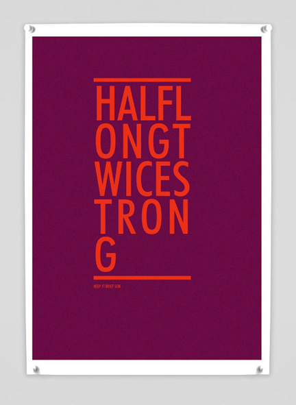
En marzo, en Tipográficamente, te presentamos a Mr. Phomer, en un reportaje exclusivo.
1. Where do you find inspiration for works like Tips on Posters?
As in most of my work, in my everyday life,the music and movies and stuff i read , what i see and hear on the streets, my own problems, and happy moments.
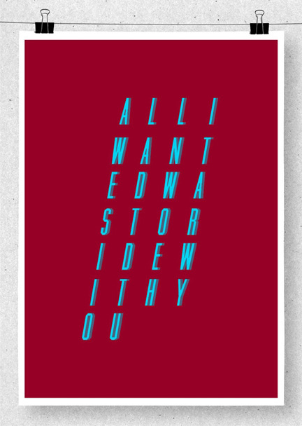
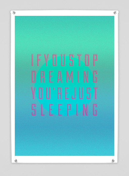
2. How to choose the fonts for each line? What was the hardest?
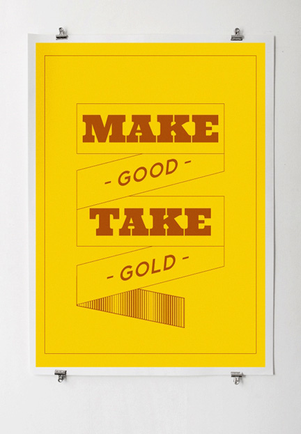
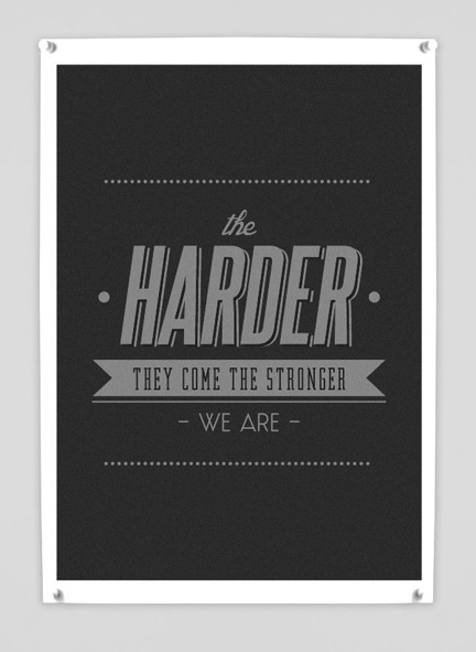
The lines always come first, i'm known amoungst my friends as the guy who always has the snappy comeback, always got some cool or stupid line to drop. I think of them everyday, and most of the times, when i get the chance i write them down.After that i choose if i'm using them as lines or if i translate them into illustrations or pictures. i think that's the hardest part for me. Then when i see it, it just gets easy, beacuse i can picture it on my head already, i just have to find the similar font as i see in my head, when it comes to graphic design, witch is not my favorite discipline, it's usually only a stectic thing.
3. How comes his love for fonts?
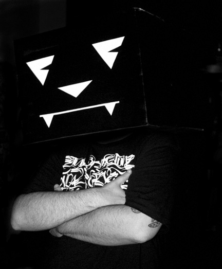
My love for fonts i guess it came as a kid, from the cartoons, i always payed attention to the letterings and tryed to remake my own versions, and of course it got really really big with graffitti. I think they should teach graffitti fonts in design schools, beacuse it's a powerfull thing, the way the typografy develops in graffitti, the many styles and shapes on with a letter can be, it's actually a very interesting and skillfull thing to know. I get really anoyed as most of graphic designers can´t read letters in a graffitti and ask what's written in there, that just shows lack of visual culture and typography knowledge.
4. How long does it take you to make one of these posters?
As i saied, the most difficult and long part is choosing the line and picture it as a form. Then as soon as it's in my mind and i can visualise it, it's actually kind of fast. As Graphic Design not being my favorite thing to do, i think i'm lucky, or well trained, because it comes out really easy and fast for me, and i think it looks good :)
5. How to define your style?
My style in graphic design i think it's diffent from my general illustration, but of course it always has that 80's, street, coolness,music influence on it.
I can´t say i've finally found my defenit visual style, 'cause i'm always trying new stuff, and i can´t seem to settle for good with anything, maybe that's a problem, maybe it's just fun. But i've came to develop a certain style through time with all those experiences by getting some bits of them and keepin' the ones i like more.
The conceptual style i think it's more clear, at least for me, i grew this everyday life message thing in my work and i think that's now a more recognizable style wich people associate with my name and seem to like it. I've given up on tecnique and i'm going more and more to message and simplifying the visual part. the day i can just put up a blob of ink and can transmit the message ( either really deep or just a silly joke) i think that will be my final style.
6. What are your artistic influences?
I get influences from very different places.
The strongest one is obviously graffitti, it was what get me started. From the first time i saw that classic LEE train and Dondi pieces i was in love forever.
The other big influences are rock posters and albuns from the 70's, and other stuff i got my hands on from my father, those mighty retro cartoons, i just love 50´s and 60's animation, i grew up with it as a kid and it just stucked into my mind. And then there's lots of illustrators and fine artists like Francis Bacon,Hieronymus Bosch, Robert Crumb,Hayao Miyazaki,Matthieu Bessudo, Finsta,Parra, just to name a few from a different range. From the classics to kids that come up everyday, that just influences me in the sence that i'm always feeling freshed up when i discover new visuals or rediscover old ones and makes me wanna try new stuff and get my hands down to work.
7.What techniques do you use?
It always begins with pencil and pen on some random paper, then for grapchic design, i'm just very tight, don´t like to mess arround that much, just put it on photoshop and that's it. For illustration it's different, i like to play arround more and try new stuff and materials all the time, even if it doesn't show on the final piece.
- Lo Mejor 2011: Exclusivo, Viktor Hertz Nos Presenta Sus Pictogram Movie Poster
En abril pasado, te presentamos, en primicia latina, al diseñador sueco Viktor Hertz quien se había metido con los íconos típicos que se usan en los baños para hacer sus afiches de cine. En aquel momento, nadie lo había entrevistado, pero todos...
- Exclusivo: El Sueco Viktor Hertz Nos Presenta Sus Pictogram Music Posters
En abril pasado, te presentamos, en primicia latina, al diseñador sueco Viktor Hertz quien se había metido con los íconos típicos que se usan en los baños para hacer sus afiches de cine. En aquel momento, nadie lo había entrevistado, pero todos...
- Exclusivo: Viktor Hertz Nos Presenta Sus Pictogram Movie Poster
1. How the idea for Pictogram Movie Poster? I’ve always loved film and film posters, and also pictograms. So, it was a natural evolution for me to combine these two interests and start a project, doing pictogram movie posters. It was also quite a...
- Exclusivo: Te Presentamos Ensemble, The Style Of Music
(photo: Alex Browne / EZASA2B) Hablamos con el artista canadiense James-Alexander Mathers, responsable de una serie de afiches que trata de mostrar los distintos estilos de música a través de su estilo de vestimenta. Una experiencia muy cercana a lo...
- Exclusivo: Te Presentamos La Porn Typo
Te lo adelantamos la semana pasada. El próximo número de la revista Hotel Visual tendrá como huseped especial al diseñador portugués Akacorleone. El generò esta tipografía y después, a propuesta nuestra, terminó de completar el alfabeto. My...
Artes Visuales
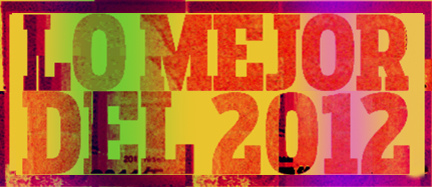
Lo Mejor 2012: Los afiches tipográficos de Mr. Phomer
Había nacido en Lisboa, Portugal. Pero en todos los blogs, Mr. Phomer parecía ser un inglés de Londres. También en todos esos blogs se preocupaban por repetir un dato que sostenía su última obra. En todos aparecía que él era un amante de las tipografías, olvidando un poco que él también es un artista terriblemente urbano. En marzo, en Tipográficamente, te presentamos a Mr. Phomer, en un reportaje exclusivo.
1. Where do you find inspiration for works like Tips on Posters?
As in most of my work, in my everyday life,the music and movies and stuff i read , what i see and hear on the streets, my own problems, and happy moments.
2. How to choose the fonts for each line? What was the hardest?
The lines always come first, i'm known amoungst my friends as the guy who always has the snappy comeback, always got some cool or stupid line to drop. I think of them everyday, and most of the times, when i get the chance i write them down.After that i choose if i'm using them as lines or if i translate them into illustrations or pictures. i think that's the hardest part for me. Then when i see it, it just gets easy, beacuse i can picture it on my head already, i just have to find the similar font as i see in my head, when it comes to graphic design, witch is not my favorite discipline, it's usually only a stectic thing.
3. How comes his love for fonts?
My love for fonts i guess it came as a kid, from the cartoons, i always payed attention to the letterings and tryed to remake my own versions, and of course it got really really big with graffitti. I think they should teach graffitti fonts in design schools, beacuse it's a powerfull thing, the way the typografy develops in graffitti, the many styles and shapes on with a letter can be, it's actually a very interesting and skillfull thing to know. I get really anoyed as most of graphic designers can´t read letters in a graffitti and ask what's written in there, that just shows lack of visual culture and typography knowledge.
4. How long does it take you to make one of these posters?
As i saied, the most difficult and long part is choosing the line and picture it as a form. Then as soon as it's in my mind and i can visualise it, it's actually kind of fast. As Graphic Design not being my favorite thing to do, i think i'm lucky, or well trained, because it comes out really easy and fast for me, and i think it looks good :)
5. How to define your style?
My style in graphic design i think it's diffent from my general illustration, but of course it always has that 80's, street, coolness,music influence on it.
I can´t say i've finally found my defenit visual style, 'cause i'm always trying new stuff, and i can´t seem to settle for good with anything, maybe that's a problem, maybe it's just fun. But i've came to develop a certain style through time with all those experiences by getting some bits of them and keepin' the ones i like more.
The conceptual style i think it's more clear, at least for me, i grew this everyday life message thing in my work and i think that's now a more recognizable style wich people associate with my name and seem to like it. I've given up on tecnique and i'm going more and more to message and simplifying the visual part. the day i can just put up a blob of ink and can transmit the message ( either really deep or just a silly joke) i think that will be my final style.
6. What are your artistic influences?
I get influences from very different places.
The strongest one is obviously graffitti, it was what get me started. From the first time i saw that classic LEE train and Dondi pieces i was in love forever.
The other big influences are rock posters and albuns from the 70's, and other stuff i got my hands on from my father, those mighty retro cartoons, i just love 50´s and 60's animation, i grew up with it as a kid and it just stucked into my mind. And then there's lots of illustrators and fine artists like Francis Bacon,Hieronymus Bosch, Robert Crumb,Hayao Miyazaki,Matthieu Bessudo, Finsta,Parra, just to name a few from a different range. From the classics to kids that come up everyday, that just influences me in the sence that i'm always feeling freshed up when i discover new visuals or rediscover old ones and makes me wanna try new stuff and get my hands down to work.
7.What techniques do you use?
It always begins with pencil and pen on some random paper, then for grapchic design, i'm just very tight, don´t like to mess arround that much, just put it on photoshop and that's it. For illustration it's different, i like to play arround more and try new stuff and materials all the time, even if it doesn't show on the final piece.
- Lo Mejor 2011: Exclusivo, Viktor Hertz Nos Presenta Sus Pictogram Movie Poster
En abril pasado, te presentamos, en primicia latina, al diseñador sueco Viktor Hertz quien se había metido con los íconos típicos que se usan en los baños para hacer sus afiches de cine. En aquel momento, nadie lo había entrevistado, pero todos...
- Exclusivo: El Sueco Viktor Hertz Nos Presenta Sus Pictogram Music Posters
En abril pasado, te presentamos, en primicia latina, al diseñador sueco Viktor Hertz quien se había metido con los íconos típicos que se usan en los baños para hacer sus afiches de cine. En aquel momento, nadie lo había entrevistado, pero todos...
- Exclusivo: Viktor Hertz Nos Presenta Sus Pictogram Movie Poster
1. How the idea for Pictogram Movie Poster? I’ve always loved film and film posters, and also pictograms. So, it was a natural evolution for me to combine these two interests and start a project, doing pictogram movie posters. It was also quite a...
- Exclusivo: Te Presentamos Ensemble, The Style Of Music
(photo: Alex Browne / EZASA2B) Hablamos con el artista canadiense James-Alexander Mathers, responsable de una serie de afiches que trata de mostrar los distintos estilos de música a través de su estilo de vestimenta. Una experiencia muy cercana a lo...
- Exclusivo: Te Presentamos La Porn Typo
Te lo adelantamos la semana pasada. El próximo número de la revista Hotel Visual tendrá como huseped especial al diseñador portugués Akacorleone. El generò esta tipografía y después, a propuesta nuestra, terminó de completar el alfabeto. My...