Artes Visuales
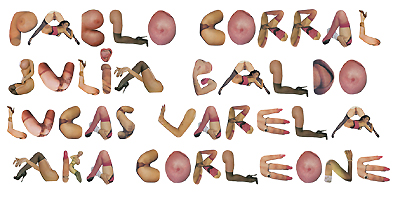
Te lo adelantamos la semana pasada. El próximo número de la revista Hotel Visual tendrá como huseped especial al diseñador portugués Akacorleone. El generò esta tipografía y después, a propuesta nuestra, terminó de completar el alfabeto.

My name is Pedro Campiche (AKACORLEONE) and i´m a 23 years old graphic designer/ illustrator from Lisbon, Portugal.
i´m currently working on a design studio in Lisbon but i also do freelance work and personal work to be able to create more creative and expressive work...
i´m influenced by street art, 60´s design, and everything i see around me on my city or abroad...
i love typography, illustration, graffiti, photography and i like to express myself using those weapons!
i´m a big fan of handmade work, so i try to use it almost every time, because in a computer based world it´s important to keep a handmade style and aesthetics,actually i can´t live without my moleskine and my pens, markers and watercolors...
about the Porn Typo...
it´s actually a nice story because it was originally created for a poster exhibition in London, which theme was to choose a day in June and illustrate it on a poster, so i chose the 10th June, which is the national day of Portugal, it´s even a bank Holiday...
so my concept was to show that as i´m not a patriotic fellow, i spent all the national day watching porn!
to illustrate this concept i decided to develop a typography using only body parts from 70´s porn stars magazines!
the most challenging part of the project was to find the courage to enter the newspaper store, choose those magazines almost hidden since the day they arrived to the store, and go to the cash register and buy it,hahah!
after that traumatizing experience, i just had fun finding letters between very tasteful shots of old school porno and turning it to a typo!
one thing i can tell you, i won´t be watching 70´s porn for a long time!
- Lo Mejor 2012: Los Afiches Tipográficos De Mr. Phomer
Había nacido en Lisboa, Portugal. Pero en todos los blogs, Mr. Phomer parecía ser un inglés de Londres. También en todos esos blogs se preocupaban por repetir un dato que sostenía su última obra. En todos aparecía que él era un amante de las tipografías,...
- Exclusivo: Te Presentamos La Ren & Stimpy Type
Él no es un tipógrafo consagrado. Pero el norteamericano Nathan Walker ha saltado a la popularidad por inventar una tipografía basada en la estética bizarra de las series animadas Ren & Stimpy y Aaahh! Real Monsters. Desde su estudio All The Pretty...
- Exclusivo: Viktor Hertz Nos Presenta Sus Pictogram Movie Poster
1. How the idea for Pictogram Movie Poster? I’ve always loved film and film posters, and also pictograms. So, it was a natural evolution for me to combine these two interests and start a project, doing pictogram movie posters. It was also quite a...
- Exclusivo: Hablamos Con Julian Hansen, Creador Del Typeface
(Hacer click para agrandar) (Por Bender Baruch) Te contamos que las redes sociales habían explotado con la aparición de una infografía mural que buscaba aportar soluciones al problema diario de la elección tipográfica. Te presentamos al creador...
- Jacob Benison In English
Nos han pedido la versión original del reportaje al artista editorial Jacob Benison. Como no es de conceder muchas entrevistas, sus colegas norteamericanos quieren aprovechar ésta para conocerlo un poco más. Además de la versión en inglés, hemos...
Artes Visuales
Exclusivo: Te presentamos la Porn Typo
Te lo adelantamos la semana pasada. El próximo número de la revista Hotel Visual tendrá como huseped especial al diseñador portugués Akacorleone. El generò esta tipografía y después, a propuesta nuestra, terminó de completar el alfabeto.
My name is Pedro Campiche (AKACORLEONE) and i´m a 23 years old graphic designer/ illustrator from Lisbon, Portugal.
i´m currently working on a design studio in Lisbon but i also do freelance work and personal work to be able to create more creative and expressive work...
i´m influenced by street art, 60´s design, and everything i see around me on my city or abroad...
i love typography, illustration, graffiti, photography and i like to express myself using those weapons!
i´m a big fan of handmade work, so i try to use it almost every time, because in a computer based world it´s important to keep a handmade style and aesthetics,actually i can´t live without my moleskine and my pens, markers and watercolors...
about the Porn Typo...
it´s actually a nice story because it was originally created for a poster exhibition in London, which theme was to choose a day in June and illustrate it on a poster, so i chose the 10th June, which is the national day of Portugal, it´s even a bank Holiday...
so my concept was to show that as i´m not a patriotic fellow, i spent all the national day watching porn!
to illustrate this concept i decided to develop a typography using only body parts from 70´s porn stars magazines!
the most challenging part of the project was to find the courage to enter the newspaper store, choose those magazines almost hidden since the day they arrived to the store, and go to the cash register and buy it,hahah!
after that traumatizing experience, i just had fun finding letters between very tasteful shots of old school porno and turning it to a typo!
one thing i can tell you, i won´t be watching 70´s porn for a long time!
- Lo Mejor 2012: Los Afiches Tipográficos De Mr. Phomer
Había nacido en Lisboa, Portugal. Pero en todos los blogs, Mr. Phomer parecía ser un inglés de Londres. También en todos esos blogs se preocupaban por repetir un dato que sostenía su última obra. En todos aparecía que él era un amante de las tipografías,...
- Exclusivo: Te Presentamos La Ren & Stimpy Type
Él no es un tipógrafo consagrado. Pero el norteamericano Nathan Walker ha saltado a la popularidad por inventar una tipografía basada en la estética bizarra de las series animadas Ren & Stimpy y Aaahh! Real Monsters. Desde su estudio All The Pretty...
- Exclusivo: Viktor Hertz Nos Presenta Sus Pictogram Movie Poster
1. How the idea for Pictogram Movie Poster? I’ve always loved film and film posters, and also pictograms. So, it was a natural evolution for me to combine these two interests and start a project, doing pictogram movie posters. It was also quite a...
- Exclusivo: Hablamos Con Julian Hansen, Creador Del Typeface
(Hacer click para agrandar) (Por Bender Baruch) Te contamos que las redes sociales habían explotado con la aparición de una infografía mural que buscaba aportar soluciones al problema diario de la elección tipográfica. Te presentamos al creador...
- Jacob Benison In English
Nos han pedido la versión original del reportaje al artista editorial Jacob Benison. Como no es de conceder muchas entrevistas, sus colegas norteamericanos quieren aprovechar ésta para conocerlo un poco más. Además de la versión en inglés, hemos...