Artes Visuales
Te habíamos contado que íbamos a entrevistar al francés Stéphane Massa-Bidal, creador del proyecto ”Retrofuturs”, mix entre el pasado, el presente y el futuro, con una poderosa pátina vintage. Lo que empezó siendo un simple juego en Flickr, después fue un boom en las redes sociales. Pero ningún medio latino lo había entrevistado hasta hoy. En exclusiva, Stéphane Massa-Bidal en Visualmente.
1. How would you define this project of yours that is gaining attention in both social networks called Retrofuturs?
Social networks are not an end in itself in my work. This is only part of my graphic work, and as I work in social networks, it helps me to understand these technologies and especially the digest.
In fact, I work more on the report "real life / digital life": how social networks integrate our lives or vice versa, what are our body parts in interaction with the media, how to conceptualize the songs of Elvis Presley and networks social or even how to represent Apple's products in relation to the body for example.
In this framework, I try to identify relationships when I find an interesting idea to dig. I listen and I read a lot about the uses of technology. Most of the ideas that I illustrate graphs are the result of collisions that come with attention to some points of discussion.
2. How an idea? First sketches on paper, then work with Photoshop?
My ideas are surely the most striking by far, because they take me like that. My brain works in secret, in hidden time some would say.
I only work on screen, I do not draw, I try instead to build the image with what she told me by testing several tracks.
(Si querés verYoutube, Twitter, MySpace y LinkedIn, entrá a Chillart)
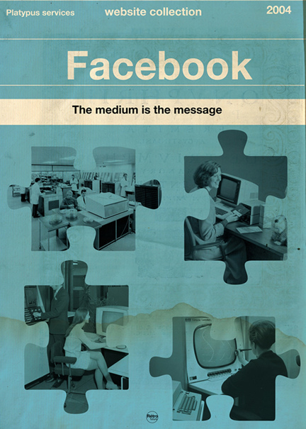
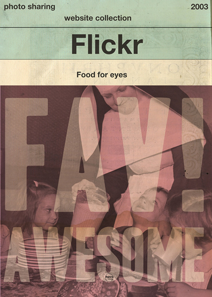
3. How did the idea to do some book covers for Facebook, Twitter, Flickr and YouTube?
I was to get my daughter who was finishing his nap, when crossing the corridor, I thought: "What if social networks are book covers?". I had for some time wanted to work Penguin book covers. I mounted the pictures and documented the accompanying text, in two days, it was done.

4. How did you get the Vader Warhol?
Darth Vader with Marilyn Monroe as Andrew Warhol, a missing piece of the image processing for Warhol. In fact, I think I got the idea while thinking of Marilyn Monroe, Mao and Warhol. Darth Vader as well deserves its head in the style of Warhol, I think I made him happy ...
In fact, Darth Vader and Marilyn Monroe are icons that I enjoy working, I have therefore combined.
(Si querés ver más cambios tipográficos, entrá a Tipografícamente)
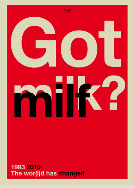
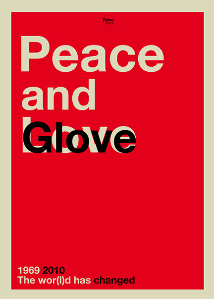
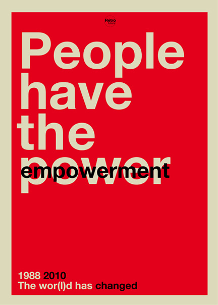
5. What is the project the Wor (l) d to have changed?
This series was born as a result of an old image I had done two years ago: Sex, Toys and Rock'n Roll. As I shall later question 9, I work more on textual aspects of late. The idea is to replace or change an item, it changes the paradigm in which it is and find its value (substitution principle to find a value in structural assembly) and given to understand that some aspects of society evolves.
6. What do you mean by this sentence: "The graphics are a tool to change your mind"?
When I started to make some pictures, I was often struck by images without meaning, a lot of effects, pretty things, but really, why?
Because of my training, I look for meaning, to build relationships, to try to understand what makes us better consumers to swallow. In this sense, I work sometimes some images (Monsanto, marketing, cancer, Apartam, climate change ...) I even made an album on my Flickr, it is to say!
In fact, that I denounce, everyone knows, I am even well below the reality ...
6. What are your influences aesthetic?
Futurism, the 50, 30, collage, pop, black humor (the French Hara-Kiri) and René Magritte.
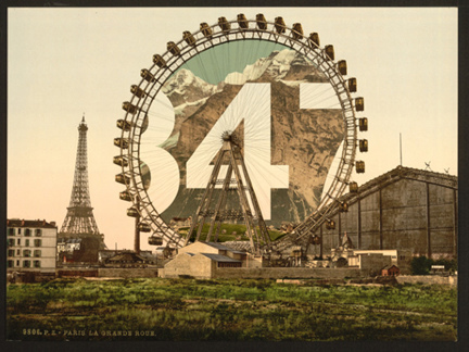
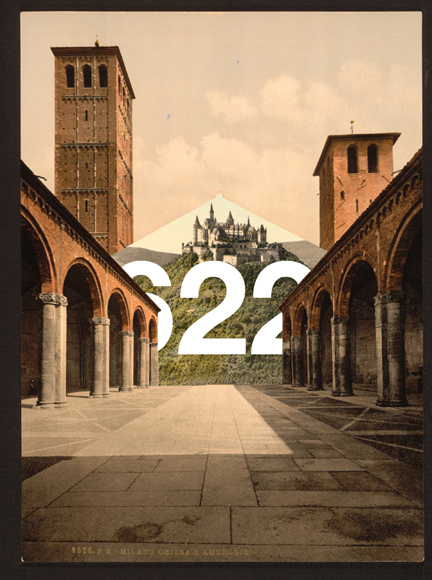
7. Tell us how you work in this special series with Helvetica, showing landscapes and figures.
As I have said before, I like the work of René Magritte. Also, I tried to work as a principle of substitution: replacing an architectural feature in a landscape, like a passage. With this in mind have grown up the numbers, like the gates of Stargate.
8. What are your plans now?
I manipulate the images vintage least for now, I reserve for commisioned works.
I post pictures of a little less because I'm working on three large personal projects simultaneously, and they are quite different from those I made earlier.
I work a lot more now on the text, and the series "The wor (l) d HAS changed" is the first effect.
In a way, I return to my first love is literature that the ratio of words of text and slogans in our society. With this in mind, I developed two major projects:
The first major project called "the medium is the message" I accept texts in different formats suited (shorts, boxers, t-shirts and aprons);
the second is more like UFO literary texts I work erotic writings under stress (like the "Exercises in Style" by Raymond Queneau). I plan and conduct a book written and illustrated with my own way.
Third and last major project: "Viva la geolocalización" (also known as "G project").
My biggest graphic design, which I worked for over six months, where I am designer and artistic director. I joined a very good friend and graphic designer to finalize look more shown for this project. I do not know yet what will be its final form but it will certainly be declined as a book, exhibition, posters and products.
- Exclusivo: Este Jueves, Stéphane Massa-bidal, Creador De Retrofuturs, En Visualmente
Un lujo absoluto. Te habíamos contado que íbamos a entrevistar al francés Stéphane Massa-Bidal, creador de un proyecto muy poderoso que venimos siguiendo desde hace tiempo. El llamado ”Retrofuturs” era un mix entre el pasado, el presente y el...
- Exclusivo: Viktor Hertz Nos Presenta Sus Pictogram Movie Poster
1. How the idea for Pictogram Movie Poster? I’ve always loved film and film posters, and also pictograms. So, it was a natural evolution for me to combine these two interests and start a project, doing pictogram movie posters. It was also quite a...
- Lo Mejor Del 2010: Los Discos Minimalistas De Ty Lettau
Mucho no le gusta que le digan minimalista, ni ilustrador. Confiesa que es malo dibujando, pero su poder de síntesis lo llevo a la fama efímera del bloggismo. Este profesional de Adobe irrumpió en varios sitios de diseño por sus versiones de los...
- Exclusivo: Ty Lettau Nos Habla De Sus Tapas De Discos
Mucho no le gusta que le digan minimalista, ni ilustrador. Confiesa que es malo dibujando, pero su poder de síntesis lo llevo a la fama efímera del bloggismo. Este profesional de Adobe irrumpió en varios sitios de diseño por sus versiones de los...
- Jacob Benison In English
Nos han pedido la versión original del reportaje al artista editorial Jacob Benison. Como no es de conceder muchas entrevistas, sus colegas norteamericanos quieren aprovechar ésta para conocerlo un poco más. Además de la versión en inglés, hemos...
Artes Visuales
Lo Mejor 2011: Hablamos con francés Stéphane Massa-Bidal, creador de ”Retrofuturs”


Te habíamos contado que íbamos a entrevistar al francés Stéphane Massa-Bidal, creador del proyecto ”Retrofuturs”, mix entre el pasado, el presente y el futuro, con una poderosa pátina vintage. Lo que empezó siendo un simple juego en Flickr, después fue un boom en las redes sociales. Pero ningún medio latino lo había entrevistado hasta hoy. En exclusiva, Stéphane Massa-Bidal en Visualmente.
1. How would you define this project of yours that is gaining attention in both social networks called Retrofuturs?
Social networks are not an end in itself in my work. This is only part of my graphic work, and as I work in social networks, it helps me to understand these technologies and especially the digest.
In fact, I work more on the report "real life / digital life": how social networks integrate our lives or vice versa, what are our body parts in interaction with the media, how to conceptualize the songs of Elvis Presley and networks social or even how to represent Apple's products in relation to the body for example.
In this framework, I try to identify relationships when I find an interesting idea to dig. I listen and I read a lot about the uses of technology. Most of the ideas that I illustrate graphs are the result of collisions that come with attention to some points of discussion.
2. How an idea? First sketches on paper, then work with Photoshop?
My ideas are surely the most striking by far, because they take me like that. My brain works in secret, in hidden time some would say.
I only work on screen, I do not draw, I try instead to build the image with what she told me by testing several tracks.


(Si querés verYoutube, Twitter, MySpace y LinkedIn, entrá a Chillart)
3. How did the idea to do some book covers for Facebook, Twitter, Flickr and YouTube?
I was to get my daughter who was finishing his nap, when crossing the corridor, I thought: "What if social networks are book covers?". I had for some time wanted to work Penguin book covers. I mounted the pictures and documented the accompanying text, in two days, it was done.

4. How did you get the Vader Warhol?
Darth Vader with Marilyn Monroe as Andrew Warhol, a missing piece of the image processing for Warhol. In fact, I think I got the idea while thinking of Marilyn Monroe, Mao and Warhol. Darth Vader as well deserves its head in the style of Warhol, I think I made him happy ...
In fact, Darth Vader and Marilyn Monroe are icons that I enjoy working, I have therefore combined.


(Si querés ver más cambios tipográficos, entrá a Tipografícamente)
5. What is the project the Wor (l) d to have changed?
This series was born as a result of an old image I had done two years ago: Sex, Toys and Rock'n Roll. As I shall later question 9, I work more on textual aspects of late. The idea is to replace or change an item, it changes the paradigm in which it is and find its value (substitution principle to find a value in structural assembly) and given to understand that some aspects of society evolves.
6. What do you mean by this sentence: "The graphics are a tool to change your mind"?
When I started to make some pictures, I was often struck by images without meaning, a lot of effects, pretty things, but really, why?
Because of my training, I look for meaning, to build relationships, to try to understand what makes us better consumers to swallow. In this sense, I work sometimes some images (Monsanto, marketing, cancer, Apartam, climate change ...) I even made an album on my Flickr, it is to say!
In fact, that I denounce, everyone knows, I am even well below the reality ...
6. What are your influences aesthetic?
Futurism, the 50, 30, collage, pop, black humor (the French Hara-Kiri) and René Magritte.


7. Tell us how you work in this special series with Helvetica, showing landscapes and figures.
As I have said before, I like the work of René Magritte. Also, I tried to work as a principle of substitution: replacing an architectural feature in a landscape, like a passage. With this in mind have grown up the numbers, like the gates of Stargate.

8. What are your plans now?
I manipulate the images vintage least for now, I reserve for commisioned works.
I post pictures of a little less because I'm working on three large personal projects simultaneously, and they are quite different from those I made earlier.
I work a lot more now on the text, and the series "The wor (l) d HAS changed" is the first effect.
In a way, I return to my first love is literature that the ratio of words of text and slogans in our society. With this in mind, I developed two major projects:
The first major project called "the medium is the message" I accept texts in different formats suited (shorts, boxers, t-shirts and aprons);
the second is more like UFO literary texts I work erotic writings under stress (like the "Exercises in Style" by Raymond Queneau). I plan and conduct a book written and illustrated with my own way.
Third and last major project: "Viva la geolocalización" (also known as "G project").
My biggest graphic design, which I worked for over six months, where I am designer and artistic director. I joined a very good friend and graphic designer to finalize look more shown for this project. I do not know yet what will be its final form but it will certainly be declined as a book, exhibition, posters and products.
- Exclusivo: Este Jueves, Stéphane Massa-bidal, Creador De Retrofuturs, En Visualmente
Un lujo absoluto. Te habíamos contado que íbamos a entrevistar al francés Stéphane Massa-Bidal, creador de un proyecto muy poderoso que venimos siguiendo desde hace tiempo. El llamado ”Retrofuturs” era un mix entre el pasado, el presente y el...
- Exclusivo: Viktor Hertz Nos Presenta Sus Pictogram Movie Poster
1. How the idea for Pictogram Movie Poster? I’ve always loved film and film posters, and also pictograms. So, it was a natural evolution for me to combine these two interests and start a project, doing pictogram movie posters. It was also quite a...
- Lo Mejor Del 2010: Los Discos Minimalistas De Ty Lettau
Mucho no le gusta que le digan minimalista, ni ilustrador. Confiesa que es malo dibujando, pero su poder de síntesis lo llevo a la fama efímera del bloggismo. Este profesional de Adobe irrumpió en varios sitios de diseño por sus versiones de los...
- Exclusivo: Ty Lettau Nos Habla De Sus Tapas De Discos
Mucho no le gusta que le digan minimalista, ni ilustrador. Confiesa que es malo dibujando, pero su poder de síntesis lo llevo a la fama efímera del bloggismo. Este profesional de Adobe irrumpió en varios sitios de diseño por sus versiones de los...
- Jacob Benison In English
Nos han pedido la versión original del reportaje al artista editorial Jacob Benison. Como no es de conceder muchas entrevistas, sus colegas norteamericanos quieren aprovechar ésta para conocerlo un poco más. Además de la versión en inglés, hemos...
